Tips & Tricks
"Organic but different": Review by the Senior Critic Team
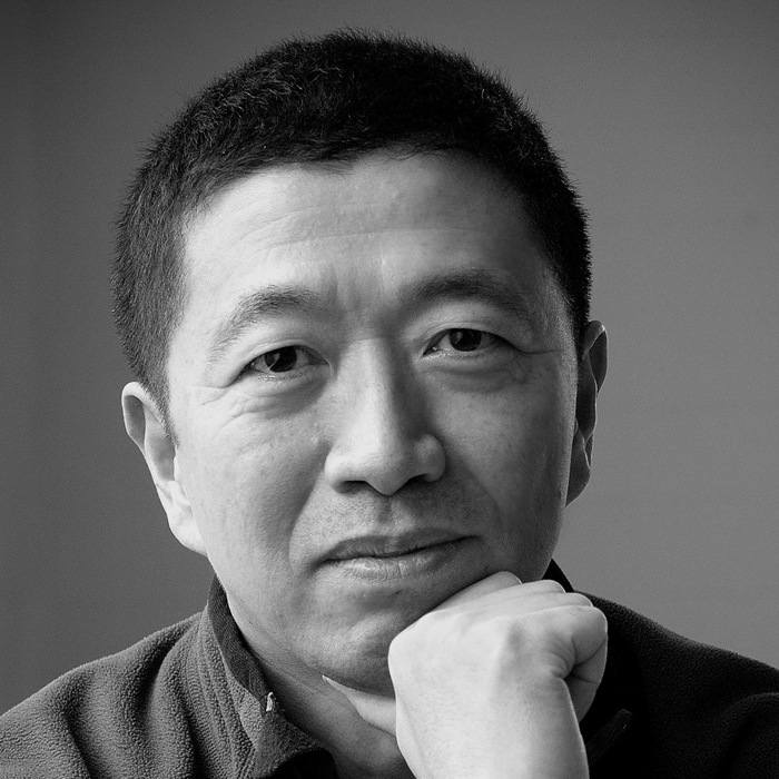
1x Blog-Tips & TricksPublished by Yvette Depaepe in collaboration with Alfred Forns, Head of the Senior Critics
1x has a unique feature the founders are very proud of: the photo critique. Members can submit pictures to a team of knowledgeable senior critics. Their feedback is useful, interesting and enriching even for the best of us.
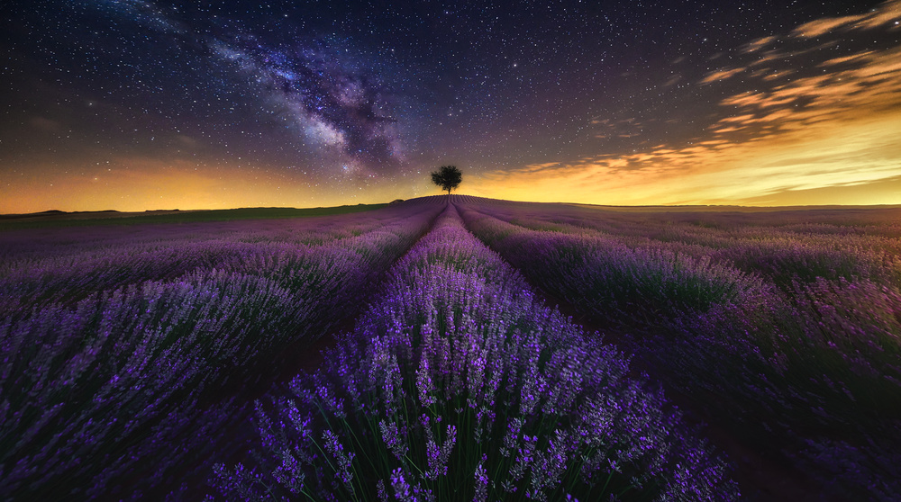
Critique on the photo ”Organic but different” submitted by Mike Kreiten
Final result AFTER following the recommendations of the Senior Critic Team

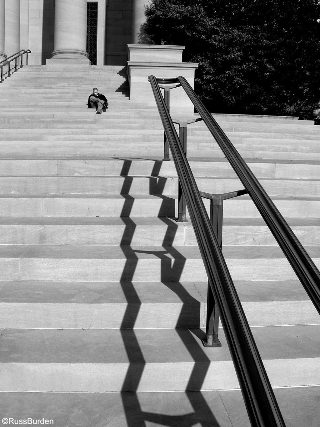
Original image with areas of changes pointed out
Mike Kreiten
I'm pretty happy with my catch as it is.
I often intentionally leave a disturbing little element in my frames, so it's obviously a picture then and not a rendering.
You never know these days! :-) I didn''t in this case, to be honest, but know I need to decide...
Remove or not?
Senior Critic Theo Luycx
You have here a wonderful composition, my compliments. Because you only ask our vision it will be a short comment.
My idea is if you go for such a nice composition, go for the last perfection. Because it is so easy to clone out, I should remove the block.
And if I will be very, very ! critical there are two points nearly diagonal which ask attention. The block already mentioned and above the white nearly left on the frame side. I should darken there a fraction for a better balance. My eyes go fast to left above.
For a good understanding your composition is great but this is my honest vision.
Marc Kreiten
You know I count on your opinion and rather take the "make it perfect" approach. It's the little "rebel" in me that sometimes shines through...
Senior Critic Dominic Schroeyers
To be very short; even with the little block there, it could be a rendering.
That said, if it was mine, I probably would remove it. I like the tones and angle, nice shot!
Senior Critic Steven T
Thanks for providing the exposure data. We need that to analyze the image properly and we can all learn from it too.
I'm from Canada, but I had no idea we had buildings like that in a suburb of Toronto. I had a quick look on Google, and enjoyed seeing the images of the Absolute Towers there. I learn something new here every day!
Your photo is excellent - the point of view really shows the strange, futuristic shapes, gives a sense of great height, and has the fashionable blurred clouds too. I like the monochrome tones with the slight blue effect. The slight 'shininess' of the towers makes them look metallic and cold. Good work!
Now, for the question - leave that tiny white triangle at the bottom right, or make it disappear?
My vote is to remove it. I appreciate that you like to leave a 'signature', but I think that small detail looks awkward and interferes with the smooth, circular flow.
Mike Kreiten
Thanks for sharing your thoughts, I followed Steve T, Theo and Dominic's recommendations. It's always a challenge I like to take up for to come up with new perspectives on subjects that were photographed in many beautiful ways. These towers are a pleasure to "play" with, and I was very lucky to have fast moving clouds on a very windy day. I did not own a 10-stop ND that time, so I had to come along with a variable filter not that intensive. So I had to wait for good constellations of clouds passing in moments sun wasn't peeking through. Took me 2 hours to get to this result and people passing were wondering what I was doing there, observing the clouds all the time. :-)
I decided to re-upload a cleaner version. I did two improvements: I removed the block and brightened up two glass panels in the middle of the left tower. So the "rendering" is now complete :-)