Articles

Want Better Photos? Use These Four Composition Techniques
Photography TalkWhen you think about how to compose a photograph, what comes to mind? The use of foreground interest or leading lines? The rule of thirds? Using light and shadows to create visual interest? While these are all excellent compositional techniques, the pool of tricks is actually much deeper and wider. Consider these other composition techniques the next time you’re framing up a shot.
Look for Uniformity

{module Google 728x90}
There can be a tendency for photographers to try to include too much in the frame, the result of which is a photo that might seem chaotic or overwhelmed with detail. The way to combat this is to focus on unity as a means of bringing greater order to the image.
When composing a uniform shot, think about what unifying factor you can use. You can highlight a color (or lack of color). Try using repeating shapes. Explore using lines as well. Any of these options can give your image a more uniform look. The more uniform it is, the more calm the viewing experience will be. However, don’t associate “calm” with boring! Shots that highlight uniformity can be quite powerful. Just look at the image above!
Emphasize Size and Shape

Related to the idea of uniformity is to emphasize objects that are of a similar size or shape. Doing so gives the image a cohesive look and feel that can be quite pleasing to the eye. Using subjects that have a similar size or shape plays into our natural desire for order. It also creates a scene in which there are repeating objects - something we also find inherently pleasing to view.
Strive for Balance

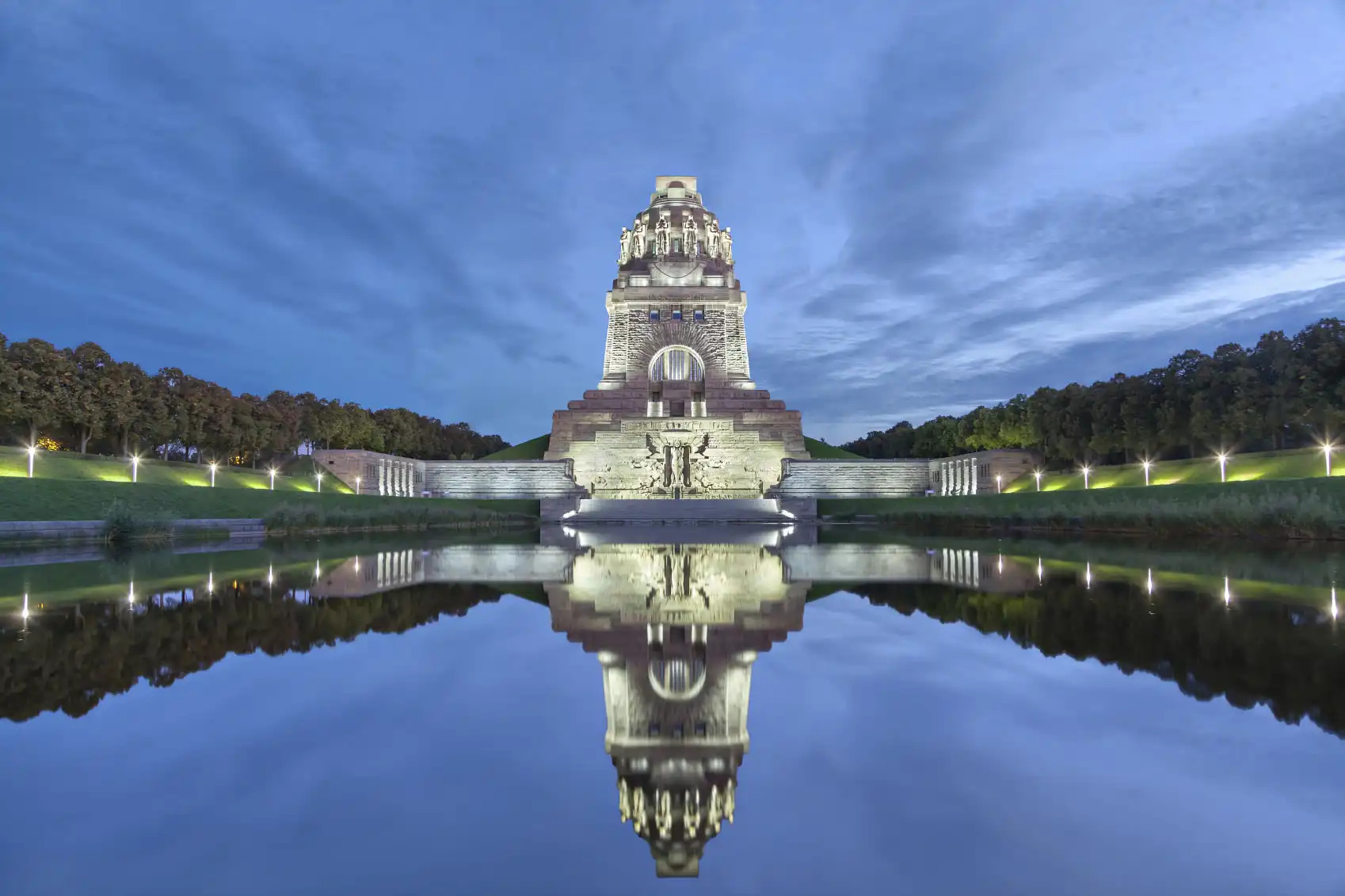
Balance can be achieved in a couple of ways. First, you can look for symmetry and achieve precise balance from left to right or top to bottom. Precise symmetry can be a bit tough to find, but when you do, it is a great vehicle for creating a perfectly balanced photo.

Another way to achieve balance is to consider visual weight. Unlike symmetry, visual weight depends not on the exact objects being mirrored on both sides of the frame. Rather, visual weight takes into account size and distance to bring balance to an image. For example, in the image above, the mountain looming on the right side of the picture would completely overwhelm the shot if it weren’t for the two red buildings on the left side of the frame. Even though we know that the houses are nowhere close to being a similar size to the mountain, their placement nearer the photographer and their bright coloring both help give the shot greater balance. This is visual weight at its best - using distance and color to achieve balance.
Don’t Shy Away From Negative Space

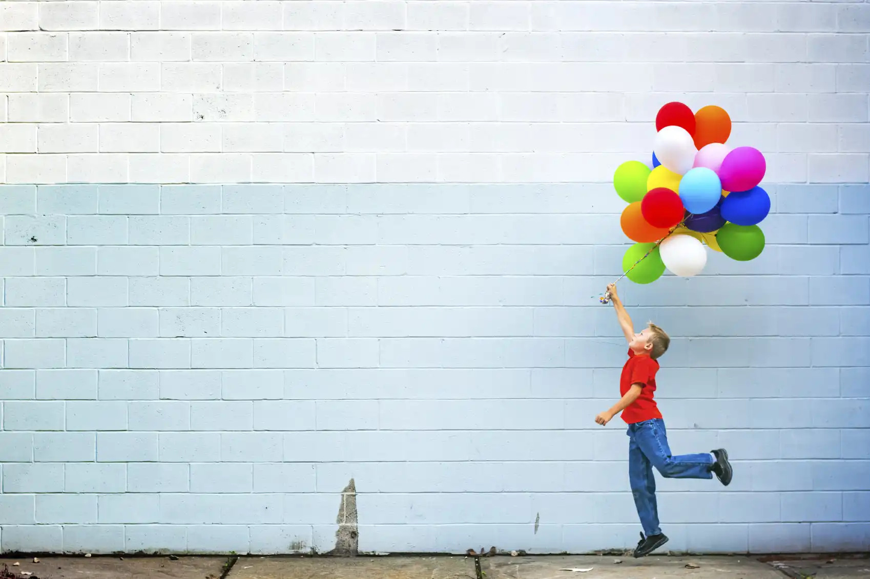
A great way to wean yourself off of composing chaotic and busy photos is to concentrate on using negative space. Negative space gives images a feeling of greater grandeur. No matter the subject - whether it’s a city skyline, a person, or a landscape - negative space can provide viewers with a better understanding of the context in which the photo was taken, including how the subject itself relates to its surroundings. One of the easiest uses of negative space is to incorporate the sky. Cloudy or blue, filling a good portion of the frame with the sky can be a very powerful tool for enhancing the composition of your photos.

And, much like using a uniform color in your photos, negative space can bring a sense of calm to a photo, even if the areas populated by the subject are a bit on the busy side. Take a look at the image above. Even though the boy’s balloons attract a lot of attention, the image isn’t overwhelming because of the use of negative space.
{module cameras T4i}
The Final Word
Creating images that are more dynamic and engaging isn’t rocket science. In fact, as we’ve seen here, it can be a relatively simple process, using simple techniques. Highlighting uniformity, similar sizes and shapes, balance, and negative space aren’t the only methods by which you can improve your compositions, but they are a good place to start. Try incorporating one (or all!) of these tips and see just how much it can change your photos for the better.
{module Article bottom share buttons}
{module Recommended Reading}


