Contests
Senior Critic review on "Diamond network" by Rodrigo Núñez Buj
1x Blog ContestsPublished by Yvette Depaepe in collaboration with Theo Luycx , Head of the Senior Critics
1x has a unique feature the founders are very proud of: the photo critique.
Members can submit pictures to a team of knowledgeable senior critics. Their feedback and different suggestions are useful, interesting and enriching even for the best of us.
Every month, two well-known 1x photographers will lend their “expert eyes” to members, providing new opinions, expertise across a diversity of genres, and photographic wisdom and insight.
Guest Critics for May are: Uliana Kharinova and Marc Huybrighs
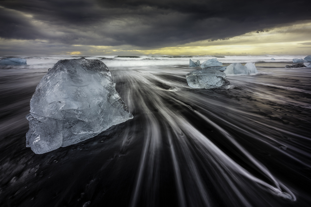
Critique on the photo ”Diamond network” submitted by Rodrigo Núñez Buj
I upload a photo here to receive ideas and advice (always useful) in order to improve an image. I understand that in some cases, the non-publication of an image is due to the tastes of the person making the final decision. In this image, awarded in a contest with an ISF gold medal, I understand that everyone may not like it, but that it does not meet the necessary parameters to not be published, i'm sorry, but I do not understand it.
Regarding its first version, I improved the sky, downplaying an area that could attract attention unnecessarily; improved the overall contrast and colors. There are spectacular photos of Jokul (and yes, many photos of Jokul..., as there are many dogs jumping and it published too), I think this can be part of the group. Sometimes, I find it hard to understand the decisions. For me, the photo is OK in this version.
Thanks for your time.
__________________________________________________________________________________
Senior Critic Calin Hanchevici
Thank you for posting the image and including the exposure details. It is not only a beautiful image, but as the ISF medal demonstrates, and excellent one. It is true that there are quite a few images with this subject, but as you pointed out, so there are lots of images of jumping dogs. Unfortunately here in "Critique" we can only share our vision about an image, sometimes suggesting improvements, sometimes only letting our own opinions and taste surface. We do not know why the curators are choosing or not choosing a particular image, and your guess is as good as ours.
As far as your image goes, I have two small observations, and please keep in mind that they will not necessarily make the image better but they are only a reflection of my taste.
There are two elements in the image that are a bit too close to its edge.
First one is the small pebble/ice in the lower right corner. The lines start beautifully from it, but I find it a bit too close. My personal preference is to have a bit more space around it (maybe 1.5 or 2x the space currently is). Having this would include more of the ice at the top right.
Second, is the ice block on the upper right, it is partially clipped by the frame, and it would be nice to have it fully in. There will be more balance in the composition this way. Alternatively, you can chose to carefully remove both this one as well as the ones that are clipped on the right side to simplify the image.
These are just nit-picking, your image is beautiful as it is, and is one to be proud of. I hope you will find this useful.
Rodrigo Núñez Buj
Thanks for your time, Calin! Your comments were different on the old version, but it was not published neather. I tried other things but possibly erroneous.
__________________________________________________________________________________
Member Paul Killeen
You have captured beautiful motion in this image. I had already a look on this photo but only got two hours. I could have spent two days on it.
I would darken down the highlights in sky on the right hand side above the frame slightly. As someone mentioned below the stone on the bottom right of the frame is slightly too close to the bottom of the frame for my personal taste. I'd personally like the stone to be the same distance from the right of the frame as it is from the bottom.
Other than that I really do like this image. Powerful movement and feel to it all. I'd like to have shot it myself. It makes me want to return to Jokulsarlon.
Rodrigo Núñez Buj
Thanks for your comment, Paul. Jokulsarlon is indeed an amazing place...
__________________________________________________________________________________
Senior Critic Norman Gabitzsch
This is a photograph with a fabuluous composition! I like the powerful lines running from the foreground to the middle of the frame. The ice makes implied lines running diagonally across the dominate lines forming a spatial juxtaposition. The clouds form a funnel that also drive the viewers eyes to the middle of the frame. Everything is in motion except the ice which is stable and anchors the image. Spectacular!
I am not going to make small suggestions on how to improve this image.
There is one thing that bothers me about this image, however, and that is the depth of field and defocused horizon. Since this is a tripod shot, I am going to suggest that the next time you get a chance to take a landscape like this, that you take three images... one focusing on the foreground, one focusing on the midground and one focusing on the horizon.
You can use focus stacking techniques available in Photoshop for combining these images into one sharp image. It's fairly easy.
Just a stunning photograph.
Rodrigo Núñez Buj
Thank you, Norman. The old version of this photo has more details and depth of field. In this version I added little blur effect on the horizon. Maybe this was an error.
__________________________________________________________________________________
Guest Senior Critic (April) Martin Zalba
Sincerely, congratulations for that gold medal. Stay with that joy. That the photo is rejected in 1x should not matter, the important thing is that you like it, that we like it.
Your image has great visual qualities and many more other things. Photographs and sometimes rejected and we don't understand why ... do not worry about that.
Rodrigo Núñez Buj
Hello Martin, thank you very much. I understand you, but in the end, when you upload a photo, you always want to see it published ... It is frustrating when you see how many members liked it and still rejected.
__________________________________________________________________________________
Critique is also open to all members, and we learn together here. If you see an image you'd like to comment on, your words would be welcome.
. '
