Contests
Senior Critics' review on "Hanoi, Vietnam, 2017 by kenichiro hagiwara
1x Blog ContestsPublished by Yvette Depaepe in collaboration with Theo Luycx, Head of the Senior Critics
1x has a unique feature the founders are very proud of: the photo critique. Members can submit pictures to a team of knowledgeable senior critics. Their feedback and different suggestions are useful, interesting and enriching even for the best of us.
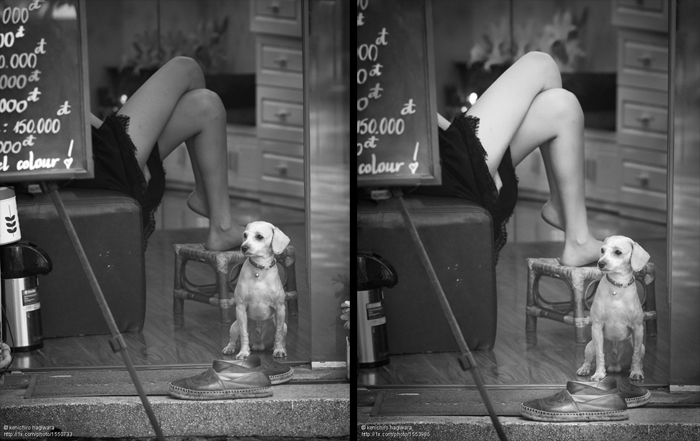
Critique on the photo ”Hanoi, Vietnam, 2018” submitted by kenichiro hagiwara
This is a street snapshot taken in Hanoi, Vietnam, 2017.
In order to point out some elements and leave them on the screen, I did a little trimming.
Although I have a point of view, I can not imagine how the viewer feels while looking to see image. Please can you give me your opinion to make this snapshot more interesting.
I upload a photo here to receive ideas and advice (always useful) in order to improve an image. I understand that in some cases, the non-publication of an image is due to the tastes of the person making the final decision. In this image, awarded in a contest with an ISF gold medal, I understand that everyone may not like it, but that it does not meet the necessary parameters to be published, I'm sorry, but I do not understand it.
 Original version submitted to the critique Final result after the Critique and published
Many thanks to the Senior Critic's team for the advice and for making my photo published.
__________________________________________________________________________________
Senior Critic Gus
I saw interesting images in your portfolio.
About this shot, if someone says, "this picture does not tell me anything" it might be because the viewer is confused about on what to fix his attention: the crossed legs of the girl or the puppy in the foreground.
What I would do first is to straighten the photo, the lower part of the step and the window frame are inclined to the left. Easy to do with the tool " free transformation” if you are a PS user.
Once this is done, I would crop this area just leaving the upper part of the step and I would eliminate the small vase on the right. This doesn't add anything to the image.
If you can, I also would remove the coffee or tea thermos on the left. I find its metallic colour annoying and distracting. Maybe a little light vignetting would help if you can not eliminate it.
Most important is to decide on what you want to catch the attention of the viewer: the dog or the girl. Once you know, work on this area by increasing the contrast a bit to emphasize that part and lower the contrasts in others, parts.
Keep in mind that this is my personal opinion. Good luck my friend.
kenichiro hagiwara
Certainly, this was not horizontal but it is my overlook. I'll try to work on the contrasts and straighten the photo. Thank you very much, Gus.
_________________________________________________________________________________
Senior Critic Steven T.
Thank you for posting your photograph, 'Hanoi, Vietnam, 2017' here in Critique. Although it's not so important for this shot that we know the exposure details - shutter speed, aperture, focal length, and ISO - we do appreciate it when members take a minute to type that in. Those who come to Critique to study the images and learn from them benefit from that information.
Gus has given some good advice for cropping out distracting details, and for using local tone adjustments to direct viewer's attention. I can't add anything to his suggestions.
You wonder how viewers feel, and what they see in the image. I can only speak for myself. I see an interesting and spontaneous, 'slice-of-life' street scene. Two main elements draw attention first - the cute dog, and the legs.
The shoes, and the background are puzzling - as are the smaller, surprise details that we see on looking more closely - but maybe they are part of the story you hope we'll find here. I am not sure if the frame-inside-the-frame is a window or a mirror. The sign is not reversed, so I assume we're looking through a window, perhaps into a beauty salon because the sign seems to be a list of prices, and because of the one word, 'colour' at the bottom. Someone passing the time, waiting with their dog for a hair cutting appointment? That's just a guess.
Because the image seems randomly chaotic, we have to look closely for a story or meaning. There is a voyeuristic aspect to the image, as there is with many street photographs - a sense we're seeing something we're not supposed to. I'm, sure interested viewers will find a variety of stories in the image. Personally I prefer that the photographer give a clue - either in the title, or with the photographic language. Otherwise I risk feeling like a fool for finding the wrong story.
And so I suggest a title . . . . . 'The Exhibitionist' . . . . or 'Uninhibited' . . . . and that could refer to either the dog or the person. Either way, a bit coarse.
These are just my opinions. I hope they won't offend.
kenichiro hagiwara
Title ... That's right. It may be important. 'Uninhibited' is interesting. Thank you very much, Steven.
__________________________________________________________________________________
Member Michael Castellano
I really like the image, even though it breaks some of the "rules", like not having more than one subject in a composition.
I have one suggestion, with a little cloning you could remove the leg holding up the sign, which tends to distract and break up the image. One does not have to have the sign being held up. It could just be leaning on something.
Would really like to travel to Vietnam one day.
kenichiro hagiwara
I see. It really seems worth considering. Thank you Michael!
_________________________________________________________________________________
Senior Critic José Hernán Cibils
A very interesting photo which catches my attention!
There are many elements, the legs, the dog, the shoe and the elements from the left.
For me, the "primary subject" is the girl showing her legs. I don't know where is she. That is probably a shop, a kind of coffee shop or similar. Why is she in that position? It is a sensual element and also an intriguing one.
The shot is suggestive and it attracts the attention of the viewer, because we try to understand the story behind the picture.
I have no problem with the lack of explanation. In my opinion, a photo should speak for itself. If you give a statement, it would be your own subjective view, which doesn't necessarily matches mine or from the other viewers.
My suggestion (agreeing with previous comments): the left part is a little distracting. I would also clone out the machine and maybe try to darken the numbers of the sign.
The little dog is also too bright in comparison with the lady's legs.
The composition is well-done. There are many diagonal lines which help us to read the picture.
A good achieved street shot! Thanks for sharing and all the best!
Kenichiro hagiwara
Thank you very much, Mr José. This was very helpful. I will work on it and re-submit the final image.
__________________________________________________________________________________
Member Joerg Sannwald
Splendid shot, in my opinion.
If it needed tweaking I'd do this: Technically I'd crop out the edge of the step at the lower edge of the frame and the hint of flower-pot on the right edge, which is very distracting because it is too bright and leads the eye out of the frame.
I'd remove the water boilers on the left border if possible or make the right edge much darker (gradient / vignette ?), but leave the legs of the tripod alone (they'd be expected in the presence of the blackboard).
Aesthetically I'd even blur the woman's legs and the background quite substantially more to create tension between the two main subjects in the frame. The idea being: The legs are where the viewer (men anyway, a genetic flaw ;-) ) will look first. Blur them and the second main interest in the frame (the dog) gets more weight.
The results will be an unexpected and refreshing perspective, playing with the viewers "normal" perception and visual preferences and a certainly much more intriguing picture with a splash of humour. Best regards and good light.
__________________________________________________________________________________
Critique is also open to all members, and we learn together here. If you see an image you'd like to comment on, your words would be welcome.


