Contests
Senior Critics' review on "Love is so short"
1x Blog ContestsPublished by Editor Yvette Depaepe in collaboration with Greg Barsh, Head of the Senior Critics
1x has a unique feature the founders are very proud of: the photo critique.
Members can submit pictures to a team of knowledgeable senior critics. Their feedback and different suggestions are useful, interesting and enriching even for the best of us.
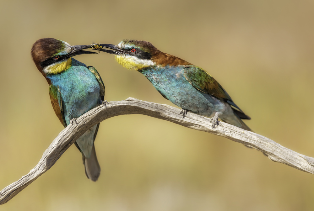
Critique on the photo ”Love is so short” by Rodrigo Núñez Buj
Original version submitted to the critique forum
Final version after applying the suggestions of the Senior Critics
I have uploaded this photo because I am very proud of my first session with "merops apiaster". I think it's a good frame twith a good position of birds and great details. The background has a correct blur. This version had 80% popularity in the members curation.
I like to know if I can improve this photo because it was not published. I know that there are plenty of photos of this bird. I think the light is correct and the blurred background too. There are details in the eyes of the birds, their position in the courtship is OK, and the noise editing seems good to me too. I don't know, if you have any ideas, I always think that if you upload many frames, all is much more simple. Thanks for your time.
__________________________________________________________________________________
Member Bernadette Heemskerk
Sorry to see that this shot was not accepted.
I like it, it is crispy sharp, has much details, A nice blurry background and shows a special. I don't know how to improve it...
May be the branch is a bit too bright?
Well, this is hair splitting, I am afraid. I hope others will give some tips to improve this photo? If not, be happy with it. It's a gorgeous one, in my humble opinion.
Rodrigo Núñez Buj
Thanks, Bernadette. I will try to improve it by working on the branch.
_________________________________________________________________________________
Senior Critic Calin Hanchevici
Thank you for sharing the image with us. It is a great capture, the birds are in focus, the beaks are open, exposure is spot on. I am sorry to hear this image was not published, unfortunately we do not have any insight in the selection process. You should not be discouraged, as this is an image to be proud of, and very likely would win awards in other competitions.
I have a single comment about your image, and that is regarding the composition. As it is now, the image is heavy on the left, all action happens on that side of the image. If you want to keep the framing, I would suggest flipping the image horizontally. To me it has a nicer flow this way. You can consider cropping a bit from the bottom such that the branch ends in the corner.
It is an excellent photo and my comment is a bit of nit-picking. I hope you will find it useful. Congratulations again, and thank you for the opportunity.
Rodrigo Núñez Buj
Hi Calin, thanks for your time and for your comments. I cropped the image from the right and at the bottom. By flipping the image horizontally as you said, the "reading" of the image should be better and more natural.
I made a new version and think it is much better after all the corrections. You can see it in my portfolio or on top of this article.
Senior Critic Calin Hanchevici
Rodrigo, thank you for sharing the new version. To me it looks much better. The branch is less bright and the viewer can enjoy the birds better.
__________________________________________________________________________________
Member Marco Maljaars
A beautiful image, colors, bokeh interaction between the birds and razor sharp. I like it a lot as also confirmed by the public curation. 80% is impressive and it deserves this acceptance rate.
The only thing here is maybe to turn the highlights, levels a bit down. It's not over exposed but there is some brightness which is a bit too much. You can see it in the branch as mentioned by Bernadette. The details are a bit lost there. If you have the raw file try to edit it in 16bits and use tools like Nik Viveza. Maybe you can try to perform just a little crop to remove some of the right.
I wish we could have some feedback from the curators during final curation, especially if you hit 80% which is high on 1x.
Rodrigo Núñez Buj
Hi Marco, I read your comment letter by letter. I have processed the image to reduce the white levels, cropped a little from right and from bottom, I have improved the bokeh showing little details. Thanks for your time, you can see the new version on my portfolio and on top of this article.
Member Marco Maljaars
Magnificent job you did, Rodrigo! May be this version will make it to the gallery now.
__________________________________________________________________________________
Member Miroslaw
I really like this photo, Rodrigo. The composition is correct, the colors are beautiful. We see on this picture a rare scene especially this fight between the birds for having food. An exceptional moment.
Just a note: I would like to have this picture with a little less light (less brightness).
Good luck.
Rodrigo Núñez Buj
Hi Miroslaw, thanks for your time! This photo is about the courtship. The male offers insects to the female bee-eater. Anyway, I have reduced the brightness in the new version that you can see in my portfolio and on top of this article.
__________________________________________________________________________________
Senior Critic Darlene Hewson
Sorry that this image was published! It is a beautiful shot - the colours and detail in the faces are super!
You didn't give us your camera settings, but based on the shallow depth of field (the tails), I would recommend in the future, closing down the aperture more so you can render the bird in focus beak to tail. You will still have a soft, dreamy background, and the detail in the feathers will be even stronger and more evident.
I believe I read below that someone had suggested working on the highlights on the branch and I agree, as it's just a little too bright, especially on the right hand side.
I think it's a great shot - great pose and definitely tells a story! You should be proud!!
I hope I have been of some help.
Rodrigo Núñez Buj
Thanks Darlene, you can see the new version with all the corrections in my portfolio and here on top of this article.
__________________________________________________________________________________
Member Hakki Aydin Ucar
Great work! I cannot say anything about composition, colors and clear background.
Flipping horizontally looks better, indeed. May be a more narrow depth of field might keep more body parts of the birds in focus, expecially on the lower part ot the bird on the right. Besides, a pitty that we cannot see the tail of that bird.
Don't worry about using a smaller aperture. The lost blur on the background can always be rendered in Photoshop later.
Critique is also open to all members, and we learn together here. If you see an image you'd like to comment on, your words would be welcome.
. '

