Contests
Conceptual Photography Reviews
1x Blog ContestsThe term 'conceptual photography' is now widely used. It is like an umbrella that covers all photography except photojournalism. But what is its essence? Is it art, a movement, a working methodology or a historical tradition?
Let's explore it a bit.
In the 1960s artist - and non artists! - freed themselves of many a rigid rule, that was imposed on them by education, conventions and society. They rebelled against, as they saw it, stuffy, elitist modernism. They wanted art to be an idea.
The conceptual photographs of the 1960s and 70s were thought experiments of words and pictures or of sequences. How these photos were made was of no importance; it was up to the viewers to complete the pictures in their imagination.
Early conceptualists like Richard Long - http://www.richardlong.org/ - and Dennis Oppenheim - http://www.dennis-oppenheim.com/ - recorded their temporary art works and performances by using a camera. Their images looked simple, straightforward, without emotion - a manner that is now described as deadpan - and are almost void of any technical sophistication. It paved the way to art photography, exclusively made for art galleries. It also lead to new varieties of conceptual photography such as fiction photography, the use of mixed media and deadpan photography.
Also the starting point changed. For the pioneers in the 1960s and 70s the idea was the art. If the idea was developed, a picture was made for documentary reasons only. For the new generation of artists, the photo was the art which was made possible by a concept.
In this review I will concentrate on
1. Conceptual art
2. Mixed media
3. Deadpan photography
4. Fiction photography
1. Conceptual art
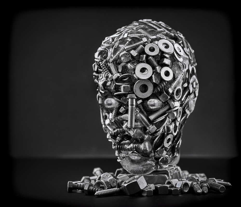
As stated above, the idea was the art the early conceptual photographers cared for and not the photograph itself. For the later generations it was the photograph - based on a concept - that mattered. This point of view is very well illustrated by Gene Dominique's photograph "Man".
In order to create his photograph, Gene built his "Man". In his own words: "Things are sometimes not what they seem; this was the guiding notion behind the photo called "Man". "Man" is the result of my meditation on how to use normal construction materials to build an object beyond the normal use of nuts, bolts, screws and washers. So, rather than create a normal structure, "Man" was created as a still-life construction."
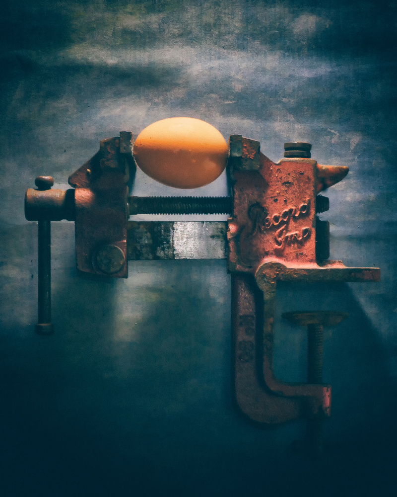
Riot Photography shows another aspect of conceptual photography of the 1960s and 70s. In those years conceptual art was often a critical comment on art and society. This critical attitude remained a constant in the later conceptual art and photography. So Riot's photo "You have to crack an egg to make an omelette" fits very well with this tradition. As to why he made this photograph Riot explains that he made it after reading a Facebook comment saying: "You have to crack eggs to make an omelette" in connection with mass surveillance of people to catch a few terrorists.
The photograph as a critical comment, speaks for itself. It looks a bit murky, as if it has been made in the photographic tradition of the early conceptualists, which is - for me at least - very attractive.
2. Mixed media
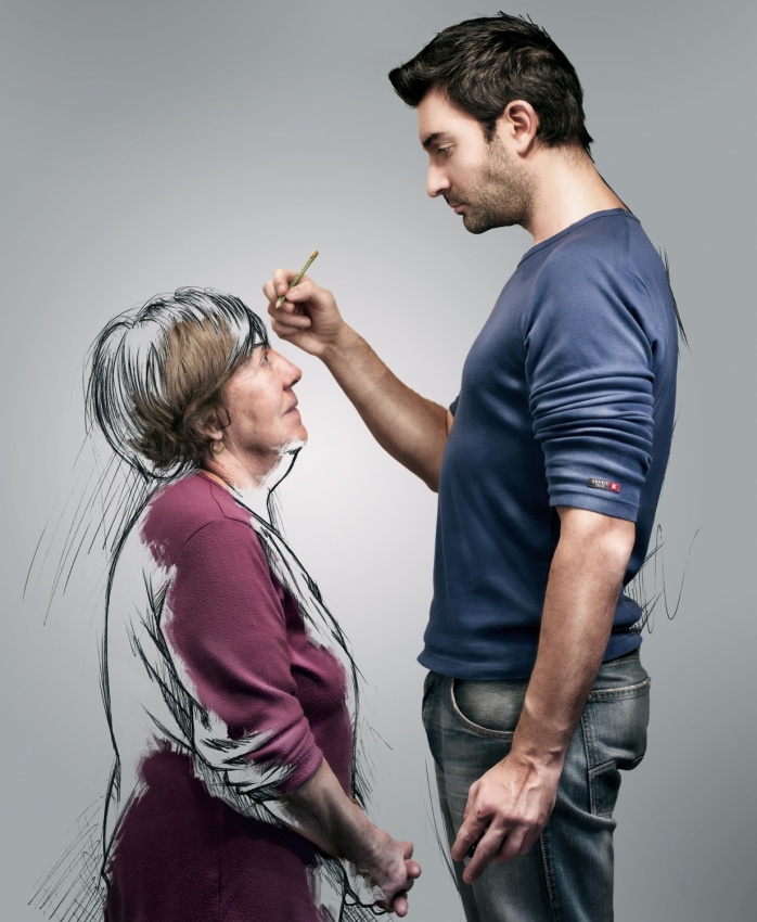
The combination of photography and other art forms such as painting and drawing, is one of the many manifestations of conceptual photography, expressing personal feelings and ideas. Instead of being presented as a depiction of reality, the photograph is created to show us things that are felt rather than seen. Sebastien DEL GROSSO and Edith Hoffman are true representatives of this movement.
Drawing and photography are the two passions of Sebastien DEL GROSSO. The combination of the two allowed him, as he said in an interview for 1x, to give free rein to his imagination, out of the ordinary and very personal. What was meant to be one "self-sketch", became, after some reflection, a series illustrating his life. In his own words: "My sketches brought to life important events and people that have influenced me or were close to me. For example, in "sketch your mentor" which depicts my grandmother teaching me how to draw."
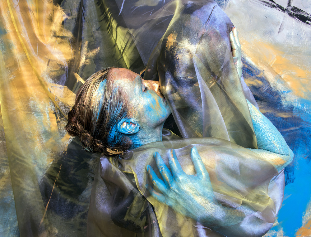
Edith Hoffmans' photograph "Sealed with a kiss" - and the other photos of a series of a project in which she shows that everybody is beautiful and unique - is a critical comment on the illusion created by Photoshop that people are perfectly and beautifully shaped, giving especially young people wrong impressions about the ideal look and shape.
To make her statement Edith combined photography and painting - her two passions. For the photo she paints an abstract background. Then she paints the model in the colours of the background painting. She also uses all kinds of props, which are the finishing touches of the art work.
Contrary to many conceptual photographs Edith uses no Photoshop. The photo is created before the camera in close collaboration with the model, giving it a wonderful mood, look and feel. As Edith says:"The image is formed in this intimate relationship between the model and myself."
3. Deadpan photography
Although modern deadpan photography originates from the way early conceptualists took their photos, it is deeply rooted in Düsseldorfer School of Bernd and Hilda Becher in Germany. At their turn the Bechers were inspired by photographers like Albert Renger-Patsch, August Sander and Erwin Blumenfeld, who according to Charlotte Cotton in "The photograph as modern art", created typologies of nature, industry, architecture and human society through the sustained photographing of single subjects.
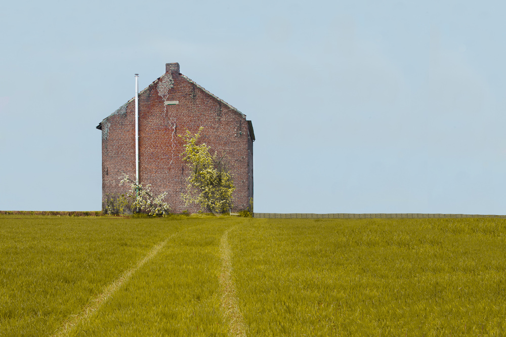
Deadpan photography displays little emotion. It seems detached and there is no joy, no sorrow and yet it has a mood of its own, as Hilde Ghesquiere's photograph “Welcome 7” shows. It is part of a series in which Hilde has been looking for places where, as she wrote in her description “I can feel the contrast in architectural and human interest, houses without doors and windows, without any connection with human.”
Except for the straightforward way of photographing the photo – and the series - has more characteristics of deadpan photography: the subject is in the centre of the image, the photographer is looking straight on at the subject and the colours are subdued. The image seems to tell us: "This is how things are”. There is nothing more in it and nothing less, but it is not simple. It is surreal and tells a story of estrangement, Straightforward is it is, is surreal and gives you a feeling of estrangement.
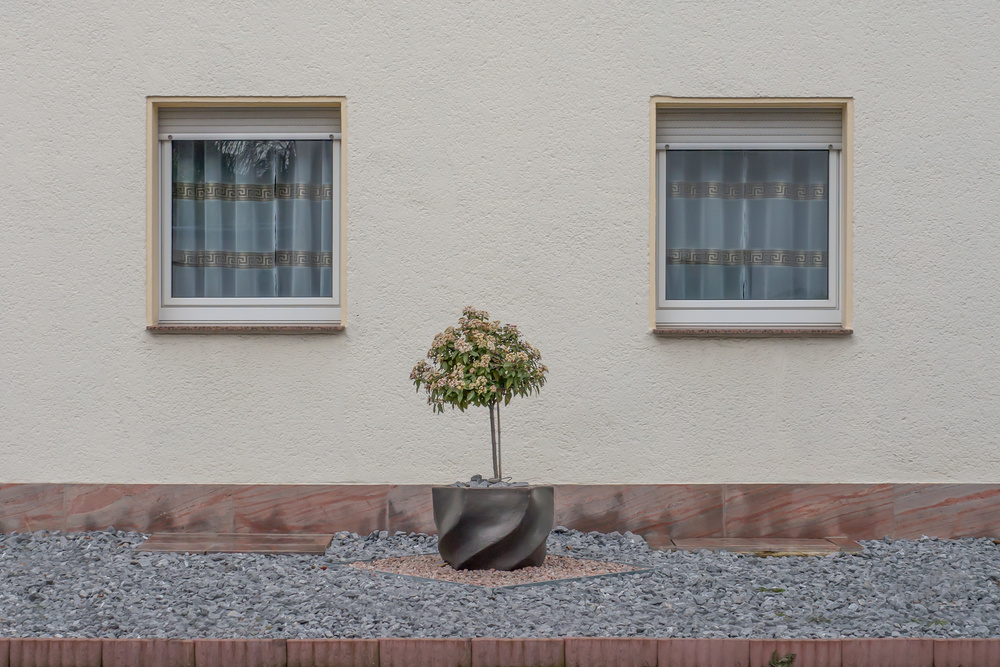
Not many people will see, stop and photograph this little urban scene. Klaus Lenzen did and presented it in de very deadpan way, letting it speak for it self. May be it is less surreal as Hilde’s photo, but it has the same mood of estrangement, that same storytelling power, which needs no drama. Things are just as they are, in all its simplicity. But are things just as they are? Isn’t there a second layer hidden in this scene? Aren’t you seeing what is not to be seen but to be felt? I think so. There is much more in it than you can see at first glance. Just look a bit longer!
4. Fiction photography
In the 1980's a new branch of conceptual photography emerged, when ideas - concepts - were combined with investigations into visual and verbal signs. Also the upcoming installation art had its influence on fiction photography.
Fiction photography is the realm of storytellers, who create scenes that were specially assembled before the camera in order to take a photograph as a work of art - but it could also be for an advertisement.
Various names have been given to fictional photography: staged photography, fabricated-to-be-photographed, tableaux vivant. I found the name fiction photography in a description of the curriculum for photography students at the Royal Academy of Arts in The Hague (Netherlands).
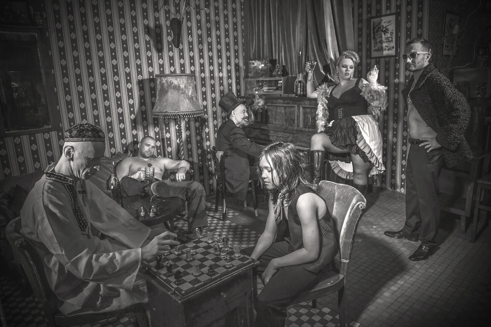
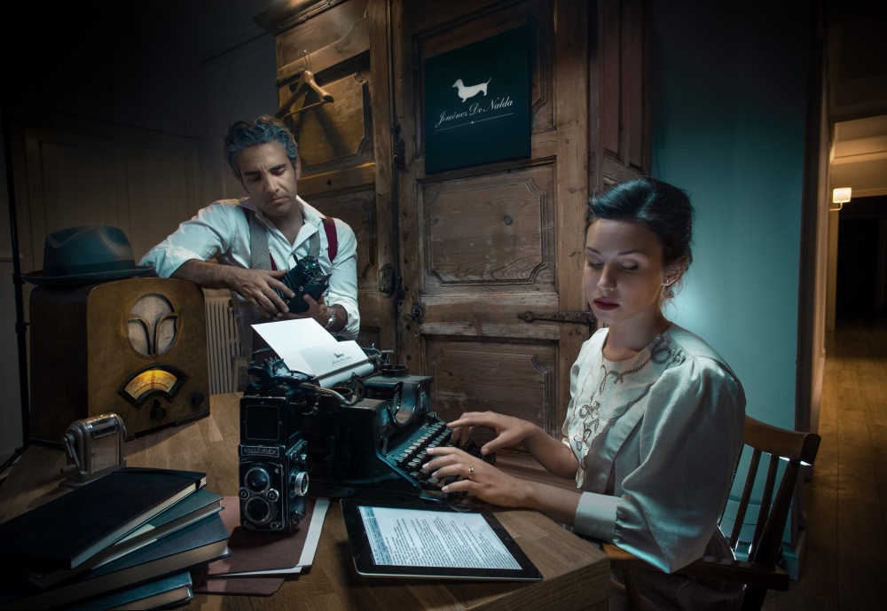
Creating a fiction photograph requires a meticulous preparation, as described by Francisco Hermandez Marzal: "I start making sketches, drawings, to define the whole composition idea, then I look for iconographic references, props, locations, models/actors and once I have everything, I begin with the shooting."
With his tableau vivant Francisco comments on the digital world of today by reversing digital back into analogue. It is like a nostalgic longing to the past, which is emphasised by the clair-obscure style of lightning.
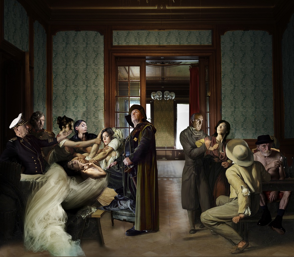
Patrizia Burra also used this clair-obscure style in her photograph “Tour”.
I am not sure that this photo is as completely staged before the camera as Francisco’s – perhaps it is more like a collage – but the tableau-vivant idea is the same.
It strongly reminds me of a photograph by the Nigerian born British artist Yinka Shonibare - http://www.yinkashonibarembe.com/artwork/photography/?image_id=50 - which I found in Photography – A Cultural History by Mary Warren Marien. The photograph is inspired by the satirical paintings of William Hogarth - http://artuk.org/discover/artworks/marriage-a-la-mode-4-the-toilette-114745/search/actor:hogarth-william-16971764/page/8/view_as/grid
Like the Hogarth painting and the Shonibare photograph, Patrizia’s image is all drama. Difference is though that she uses the light as a part of the drama.
Actually, I think it a pity that Patrizia has not explained her photo a bit. I think it is intended as a diptych, but what is the relationship between the two parts? Which drama links the two families – one rich, one poor – in the corners of the room? Is one scene the mirror image of the other? It is a metaphor for an unjust distribution of wealth in the world? There are more questions than answers – not a bad thing of course. I shall have to put my imagination at work.
Small minus of the picture is the hand of the sea captain in the left corner. It is a bit of an eye catcher. It covers the face of the women next an officer and thus diminishing its expression. In a dramatic picture like this, it should be visible.
5. Inspired by
Ralph Graef: "The series ”The Traveller“ started in March 2010 on a tour with friends from the "Fotoclub Potsdam" when we found the old brown suitcase in a bunch of bulk waste on the street. This old suitcase and the end-of-time-feeling of the partially abandoned village where we found the suitcase fueled my imaginations of the figure of a traveller in time, who finds himself in various, sometimes odd situations. In order so serve as a connecting element in a series of pictures the traveller required a high recognition value, especially since he often appears only as a small eye-catcher. Thus I have created the archetypal and nostalgic figure of a man wearing a suit and a hat, who carries a suitcase and an umbrella. For the sake of convenience, the protagonist of the series is myself, since this model is always available. I started the series with settings in the context of travel and traffic. Yet, soon I broadened the scope of the term ”travel“ to being on the way in unusual places or through passed times. The fact that my traveller usually finds himself somehow out of place in his surrounding creates suspense. Since he always retains his composure even in bizarre situations, the picture often acquire a funny aspect that keeps the photos sticking in the mind of the viewer.
As a photographer I was initially more familiar with the subjects landscape and architecture, however, with this series I found my pleasure in conceptual photo series with humans as a main element. This was also the starting point for the related project ”On The Way“ with the female photographer Uta Schönknecht. The character of the latter series is distinguished from ”The Traveller“ by its clearly recognizable actors, who refer to each other in the pictures. In ”The Traveller“ the protagonist is oft barely recognizable as an individual and often appears only as a small person. Despite of that he is always the eye-catcher and enhances the attention of the viewer for the scenery he is acting in. The individual images of the series are no consecutive sequence. Each image should tell its own story and evoke different emotions in the viewer.
I took all the photos with a digital single lens reflex camera equipped with an interval timer. Between 2010 and 2013 I have shown the pictures of this series in nine well acclaimed exhibitions in Berlin, Potsdam, Munich, Rangsdorf and Neubrandenburg. At the 4th Kunstallee Potsdam (an arts fair) from August 19th till 21st, 2011, I won the Arts Price in an election of the approximately 4000 visitors. Several photos won prices in national and international photo contests. The biggest success was a Gold Medal of Excellence for ”In The Cold“ at one of the biggest international photo contests, the Trierenberg Super Circuit 2011."
. '
