Photographers

Monthly theme Architecture winners
1x Blog-PhotographersThe winners of Monthly theme Architecture are here. Guest judge Gilbert Claes has selected the top three winners, while the rest have been chosen through public voting.
The top three winners receive the following prizes:
The 1st Prize: 100 System V5Filter Holder + 100 System ND1000 (10 stops) Filter + 100 System Soft GND8 (0.9) + 100 System Square Filter Box + 1 Filter Cleaning Cloth.
Total Value US$ 539
The 2nd Prize: 100 System V5 Filter Holder + 100 System ND1000 + 100 System Square Filter Box + 1 Filer Cleaning Cloth.
Total value US$ 369
The 3rd Prize: 100 System ND1000 (10 stops) filter + 100 System Square Filter Box.
Total value US$ 187
To read more about NiSi and their products, click here.
1st place
Judge's comments
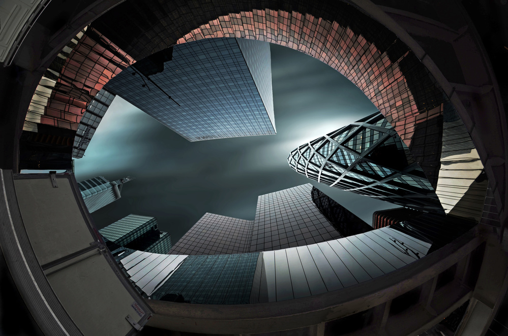
La Grande Arche de la Defense is a monument and building in the business district of La Défense to the west of Paris, France. Usually it is known as the Arche de la Défense or simply as La Grande Arche.
The photo of Thomas is very deserving because he succeeds in order to create a unity, almost perfectly balanced and this from a chaotic canvas.
The position of the photographer here is really important, and that is not obvious at this point.
It seems like a butterfly and the cables at the top are the feelers on the imagined head of the insect.
I admire the photographic eye of the author to notice this symmetry, capture and framing out.
I suppose it is a detail of a staircase in a museum.
The lines are very flattering and flowing. It remains a pleasant look piece. The curved lines end as a kind of eye ... like a symbol for each museum ... because there is 'watching' the main verb.
The handrail displays at the start of the final piece of the viewing direction. It is a necessary part of the picture and makes the place recognizable. A perfect composition and lighting with beautiful gray tones.
Especially the rich, warm color palette is a feast for the eyes.
Gehry is known for his use of metal wall coverings. This always gives a varying effect during the changing light and weather conditions of the day. The use of soft tones is a good choice. The cloud structure enriches the picture and gives dynamism to the simple composition.


