Photographers
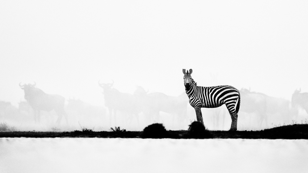
A 'must read' review by the Senior Critics on "Brave one"
1x Blog-PhotographersPublished by Yvette Depaepe in collaboration with Alfred Forns, Head of the Senior Critics
1x has a unique feature the founders are very proud of: the photo critique.
Members can submit pictures to a team of knowledgeable senior critics. Their feedback is useful, interesting and enriching even for the best of us.
Critique on the photo ”Brave One” submitted by Husain Alfraid
Ndutu during calving season, very cautious zebras and wildebeest gather to drink water and get a nice swim. However, with any sound, the chaos happens and dust flies everywhere, which creates dramatic scenery. in the photo, this Zebra was the last one to leave the water pond and gave me a final stare before it went away.
__________________________________________________________________________________
First of all, thank you for posting the shooting settings and gear used. It's really useful to learn and also to provide critique.
This is an impressive image. I like very much your creativity with the colour treatment and composition. It is a simple yet striking nature image.
My comments are very, very minor:
I'd prefer to see the silhouette of the ground close to the zebra sharp as well.
Perhaps there is too much sky on top of the zebra. Maybe you could crop a bit from the top-right corner downwards towards the bottom-left one (if you keep proportions), which would bring the zebra a bit closer to the viewer and get rid of a little of sky.
As it is, the photo seems slightly out of balance with so much "white" on top of it. I'd expect as much sky as the white band at the bottom of the frame - or at least something similar - above the zebra. I wouldn't crop from the left because the buffalo in the background is important to balance the zebra, and cropping from the left would leave it too close to the frame.
__________________________________________________________________________________
This is very interesting, and I hope you don't mind me turning the question around. I remember this shot, and also that a few members and senior critics commented on an earlier version. One suggestion was to remove a zebra, Mike Dumont felt it was distracting from the main subject.
I found the old critique on previous version titled differently as "Chaos stare".
I know these situations where I receive opinions and suggestions in critique, but some might be against my principles. Now, a few months later, you decided to try Mike's suggestions nevertheless.
So my question is why you did remove the zebra finally?
You also changed the title, from "Chaos Stare" to "Brave One", probably because your remaining zebra stands more out from the dusty background.
Did you because it was not published? Did it take a while before you liked the suggestion? Were you just curious what critique the picture would get now, though you broke your principles?
Don't get me wrong, I've done that myself a few times, I'm not blaming you at all. Critique is here to learn from others views, which are mostly different from out own, and at the same time more closer to the view on our work by all others. I had a quite extreme experience in exactly this situation, because I was published with a picture that I just put up following and interpreting several opinions. At the end I was of course happy to become published, but it did not feel like "my picture".
Basically I'm saying it's very good and interesting to "loan another pair of eyes", probably a quite unique possibility on 1x.com, but in my view we need to ponder which modifications we might pick up while still feeling comfortable with the result.
Do you? I like "Chaos Stare" more, might have to do with my passion for "discovery" pictures. I mean works that have a clear primary subject, but there is more to discover if people take the time. And Zebras have those stripes because predators can't distinguish between the many when they stand together. Which in your picture got sorted by the dust. I my view the title would be more like "Prey", because this single zebra lost the coverage it usually has in the masses.
I really like your catch, but I would also love to learn about your motivation to change it after such a long while. So I'm hoping you read this and do me the favour...
Husain Alfraid
I was really hoping that someone would bring this up as a matter of fact. You know me for many years during my journey in photography and in art in general, Mike.
Everyone has an opinion of what they might and might not like, but there is no solid ground even in fundamentals.
The main reason I reposted this version with the suggested modification is to see what you guys would say – at least the persons who remember it. My target is not to get this image published because I still love this photograph and many viewers do.
In fact, I did not clone the zebra away, I just gave it a little dodging.
I believe each photograph has its own story which could be modified, but the only real story is the one that happened.
Yes it took me several months to try this version out because for some reason I haven't posted this photo anywhere else but here on 1x, and when I posted it on other social webs, it got a lot of feedback. That is the mean reason why I submitted it again to the 1x critique.
It is more like an experiment than hoping for a publication.
As an artist I depend a lot on the viewers as well, because I'm not producing for myself only. Sometimes you have to please the viewers too.
I remember this story of Michelangelo while he was working on a sculpture. The mayor came very close and said to Michelangelo that the nose was thicker than it should and that he should chop off some pieces. Michelangelo tried to explained to the mayor that he was standing in a very odd perspective and couldn't see exactly what was going to be the final product. But Michelangelo said “OK I will fix this right away”. He went up the scaffold with a hammer and chisel and "clink clink" - "does it look better now?” while some dust was flying around.. Then he asked the mayor how it was looking now. The answer was: "now you gave live to it", but in fact Michelangelo did not change anything, he only gave the illusion that he took the suggestion.
So yes, If I'm really thinking about it as an editorial piece, I would take the suggestion, but believe me, if I was going to print this photo for my own, previous version would be my choice because the zebra in the back was this zebra's fowl, which was a series I was working on for the calving season.
Thanks Mike, for bringing this topic. I was really hoping someone would mention anything about it.
Senior Critic Mike
You were lucky, I have a bad memory for everything but pictures :-) Thank you very much for this interesting conversation! You know, "Critique" is not always about improving pictures. I really enjoy discussions about the sense of pictures, their impact, the reasons, and this one was very interesting, too. As you read in Andreas' reply, we all have these thoughts sometimes.
__________________________________________________________________________________
I guess Mike has taken up a very valid question which I ask myself from time to time as well. You did well to follow suggestions from the Critiques forum to find out what will be your and other people's opinions.
No matter if I am photographing or in the flow of post processing, sometimes I am caught in a situation where forces with different energy are pulling my thoughts to either side, losing certainty and eventually either being trapped by suggestions that are not sourced from my deep conviction. Or I stick with my initial idea but still not sure whether the decision was right. Then you have also the ambition of getting your image being published.
I find myself occasionally also in that dilemma but most of the time I try not to modify my personal signature in favour for better chances in the curation process.
As you were referring to your ethical values and therefore not really open for manipulations I think it is indeed an interesting topic for being discussed what and when such changes are OK or even necessary. In my opinion there is no boundary in what one is allowed to do. Digital processing allows so many options. In the end is OK what you as the photographer like.
Declaration might become a fair statement once the image is released for the public, but even then, if not required by the platform or audience, you are solely in charge of it. A very interesting subject matter, I hope dear Husain, you don't mind if thoughts are shared here.
Talking about your image here, I can live with this and with the original one, both are very interesting and eye-catching. What I do not like on both images is the the ground and foreground. The sharpness of the dark ground is unfortunately not at the scale I would like to see it. The foreground lacks in texture, maybe there is more that could be released in post processing?
Husain Alfraid
Thanks Andreas. I will not reply to your question with a long answer because it would probably be the same as I gave Mike. Again, if it is not for the viewers, then for who are we producing art? For our families? They will always tell you that your work looks good.
What really makes me very happy is that you guys remember this photo. It must have impressed you and that's what I'm looking for...
We all keep learning and producing ;-)
. '


