Photographers
The importance of silence in colour
The Art of Adventure - Bruce PercyI’ve had a difficult relationship with colour since I started making pictures. What may seem ‘about right’ when I’ve just edited an image, may feel ‘too strong’, or ‘too weak’ when I review the images after a short break, or maybe on a subsequent day after some rest. The more I have read about colour, the more I realise that we all perceive colour to varying degrees. What one person may feel is too strong a colour, may not be strong enough for others. Conversely, what may be just about right for some, may be too strong for others.
My tastes have changed a lot in the past decade and the colour component within my imagery has become more muted. It wasn’t a choice. It wasn’t a conscious decision. I just became aware of it when I dug through my portfolios from the past decade. There has been a slow, but sure progression in reduction in all aspects of composition for me.
Often I think that most of us assume composition is about where subjects are placed within the frame, but composition is about ALL aspects of the image: subject placement, luminosity relationships around the frame, and of course - colour.
For me, I’ve found my use of colour has become extremely selective. What may have looked ‘quite nice’ six years ago, now almost fills me with embarrassment. I think some of my earlier work is clumsy, and the colour component of the compositions is all over the place.
Indeed, being embarrassed by one’s work is healthy in my view, so long as you are not always so, and so long as it is only something you feel about work retrospectively. Because in my view, this signifies growth or change. Hopefully it indicates an improved sense of awareness.
All I know is, the more I learn, the more I realise how little I knew when I started out. That to me, in a nutshell is progress when I can look back at my earlier work and see room for improvement.
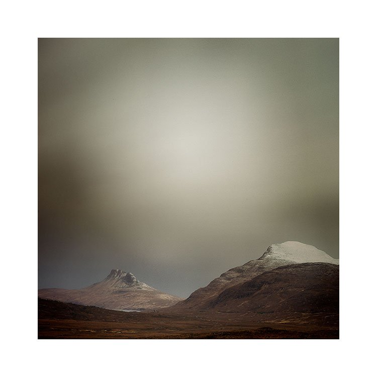
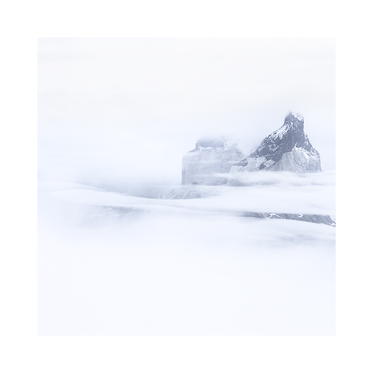
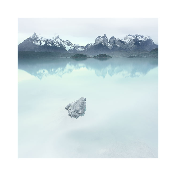
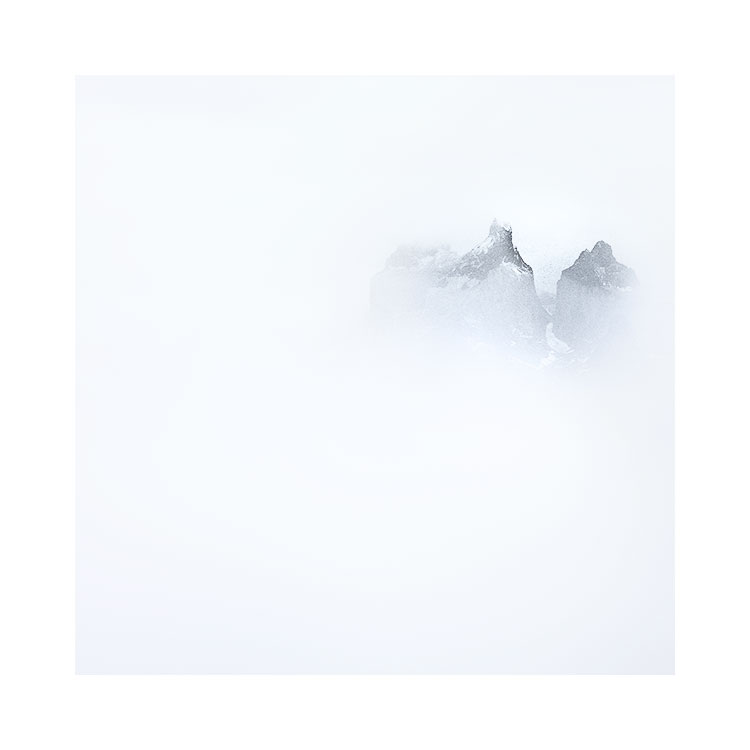
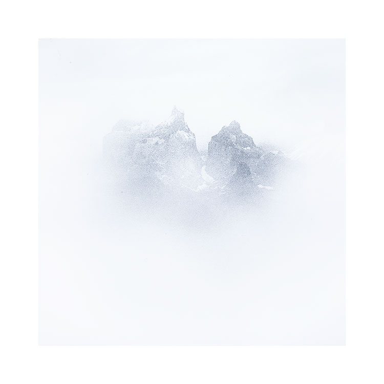
Anyway, back to colour as a component of composition. I’m aware that each of us perceives colour differently. For instance, some may find my work (see above) to have almost no colour. I know there is colour in the work, but it’s subtle, and for some who perceive the work has being black-and-white, the only way I can convince you that the work does have colour is to show you black-and-white versions below. If you compare back and forth, I think this might tell you a lot as to where the colour is, and also, what you originally perceived as ‘grey’ is actually blue. Particularly in the mountain tones:

I remember Michael Kenna being asked why he specifically worked in black-and-white. I paraphrase here, but he said something like ‘because it’s quieter’.
I never really understood this when I heard the interview a decade or so ago, but I do understand it now.
You see, I think I’ve been on a quest to make my images simpler. When I started out, things were cluttered, busy, with lots of issues and problems. First I found it was really about reducing down the composition to a few subjects, maybe three or so at most in the photo. Going to places like deserts, beaches, and working in places with very little going on has taught me so much about simplifying the content of a photo in terms of ‘objects’. But the next stage was to work with luminosity and tonal separation. I think that is perhaps the 2nd stage of composition that we all work on.
The third stage is perhaps colour. For most of us, I certainly believe that colour isn’t considered part of composition. It just ‘is’. But sometimes colour can be too dominant. First we start with trying to remove one or two colours from a composition to prevent our eye getting caught by them as it traverses across the image. But I think inevitably, as our awareness of colour develops, this too is reduced, and applied sparingly.
Perhaps I’ve just been on a path to reduction. But I don’t think so. I have often received the question ‘why don’t you go black-and-white’, which I think is a natural assumption if someone is desaturating their work. But for me, the work just becomes too one-dimensional when it has zero colour. I still need colour to exist.
So if there is a message in today’s post, it is this: images can become more ‘quiet’ if colour is used sparingly.
Although I have stated this, it does not mean that you will immediately start to reduce colour, because I think we can’t control our own tastes of what we like / don’t like. It just has to happen over time. But I do think being aware of this, and perhaps reaching for that desaturation slider, rather than trying to soup up the image might take you somewhere you might really like.
I often feel as an editor of work, and of working with participants on my Digital Darkroom class, my aim is to push the participants outside of their comfort zone. If you are always working with mid-tones and never put any blacks or absolute whites in your work, how will you know if they might add something to what you do? Similarly, if you never desaturate your work, how will you ever know if desaturating may be just where you need to go?
Colour is a critical component of composition, and just like how much care we try to take on which objects to include in the frame (and similarly which to exclude), so too should we consider colour.
Colour can be deafening, or it can subdued. I much prefer the silence that muted colour brings to my work.