Tips & Tricks
"Body shaping of nature": Review by the Senior Critic Team
1x Blog-Tips & TricksPublished by Yvette Depaepe in collaboration with Alfred Forns, Head of the Senior Critics
1x has a unique feature the founders are very proud of: the photo critique. Members can submit pictures to a team of knowledgeable senior critics. Their feedback is useful, interesting and enriching even for the best of us.
Critique on the photo ”Body shaping of nature” submitted by Hans-Wolfgang Hawerkamp
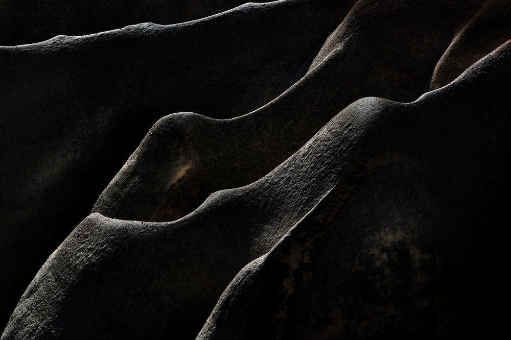
I wanted to compare the this spectacular landscape in an abstract way with Body shapes.
I am not sure about the quality and the emotions what this picture gives to the viewer. Is there something I could do to improve it? Would you recommend to present it as a b&w picture?
Senior Critic Dominic Schroeyers
This is a really nice abstract image. If you didn't have told in the description that it was a landscape, I would never have guessed it.
Still not sure what I'm looking at. Are they mountain tops, is it a close-up? You don't have to tell, it adds to the mystery.
The light is great lightening the contours and the shadows are creating depth.
The diagonal lines make it easy to read/view. I personally like the subtle colours. I would not converse it to b&w.
I cannot think of any suggestion to improve this picture. I think it is perfect like it is.
Glad to see an image of you here, thanks for submitting it to critique.
Hans-Wolfgang Hawerkamp
Thanks for your detailed analysis, Dominic.
Senior Critic Hilde Ghesquière
Thanks for posting in critique and for adding the camera settings. You've got a great picture here, I really love it. At first sight I immediately thought of body shapes. The composition is great with lovely diagonals and the little spot in the middle is the icing on the cake.
I like the structures on the stones as well as the delicate colour of the brighter spots. So, for this particular reason I wouldn't turn it into a b&w picture.
The play with shapes is very well seen. To answer your question about how to improve your picture: I would remove the upper line as well as the spot in the bottom right corner just to emphasize the diagonals and to make it really looking as body shapes. About the emotions the viewer get while looking to this picture: It sure is an image to look at longer to find something to compare with. Well I do and I really like it.
Hans-Wolfgang Hawerkamp
Thank you for your help, Hilde. I will try to improve this picture and re-upload it soon.
Senior Critic Mike Kreiten
Photographers are a strange kind of humans, I immediately recognized it as Rose Valley, having been there and being fascinated by the stone formations. All the abstraction, the colour tweaking didn't distract me, the shapes are simply unique. Your work leaves not many options to improve, basically saying I very much like what I see.
I find the upper right corner a little intensive from the reddish colour, which repeats just softly in two other sections of your picture. Knowing your work, I'm sure you left it on purpose, maybe as a hint it was taken at Rose(!) Valley. I still think it's a bit too saturated in comparison to the rest of the formations.
You could either repeat the toning on the lower and upper left corners or de-saturate the upper right a bit. Especially on the most right bright section the transition to black and white is quite hard.
I can see you spend thoughts on the corners, positioning the edge exactly in the lower right. That's a fight I always have with my spouse - she studied photography. She doesn't like it, I do exactly the same. Nevertheless I experimented with crops since there is just one thing I find has too much room in your frame, the lower right triangle. The structure prevents it from being not too much of "nothing", but I liked to crop it 2% from the left and 6% from below. This keeps the left corner on the edge of your structure, but works better for me. You may want to try it, but these are all minor things...
I don't have an unbiased view on it, since I have been there, I know what the shapes and colours look like in reality and I very much like the way you presented it. People who did not experience Rose Valley may see your picture differently, that's what I'm trying to say.
Hans-Wolfgang Hawerkamp
Thanks for your help and constructive critique, Mike.
. '


