Tips & Tricks
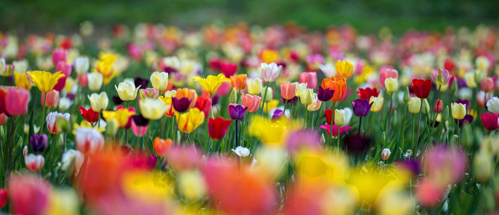
'Colourful Tulips': Review by the Senior Critics
1x Blog-Tips & TricksPublished by Yvette Depaepe in collaboration with Alfred Forns , Head of the Senior Critics
1x has a unique feature the founders are very proud of: the photo critique .
Members can submit pictures to a team of knowledgeable senior critics. Their feedback is useful, interesting and enriching even for the best of us.
Critique on the photo 'Colourful Tulips' submitted by Miro Susta .
Before capturing this photo I've evaluated the options, either to create nice colour palette with appropriate DOF or to concentrate on particular group of flowers from the colourful field.
I've opted for second option. I used my tele-lens at 400 mm and the lowest F-stop (5.6).
This enabled me to create nice blur in fore- and background.
Since I did not have tripod I set the exposure time to 1/640 sec.
In order to arrange it in longer horizontal format I've slightly cropped the upper part of the image.
I'd appreciate your suggestions-critique-comments to this photo.
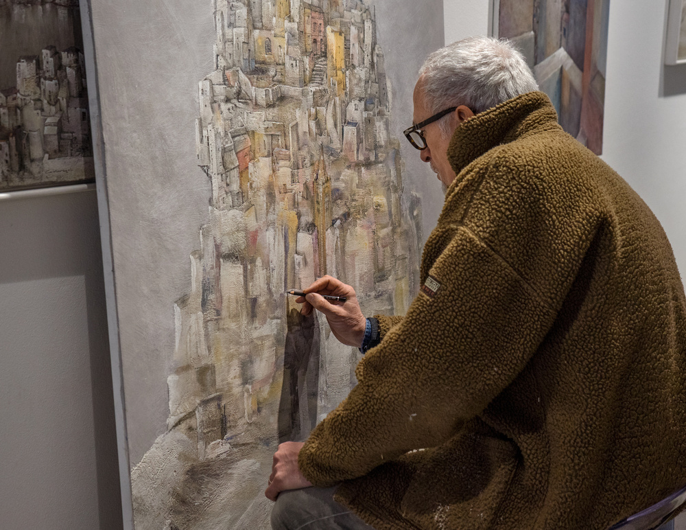
In this image I wanted to show the painting emerging from the rough draft seen at the bottom, and make it become an imaginary cityscape through the articulated lines of the pencil.
Senior Critic Victor Mozqueda
The photo has lots of beautiful and colourful flowers. It is stunning to see these fields in person I bet!
I like how the background is blurred to bring attention and focus the middle ground but not too sure about the flowers in the foreground being shown.
I wonders if this was edited a bit too much to get vibrant colours or else but I believe that due to the post processing editing the foreground picked up patches of distracting non-realistic colours on the yellow flowers. This could possibly be fix in post processing to get rid of those darker areas in yellow flowers. I have also picked up on a small white spot on the top left hand corner.
Member Thomas T. McCleave
I love the colours (although I agree a bit too much saturation) and what you have attempted to do here. I do find the foreground too large and distracting.
The blurred areas hold a greater area than the focused zone. For me, this should be reverse.
My eyes just get pulled down into the foreground blur. If I wanted to do this shot, I would opt for the maximum DOF. Maybe a 100mm lens at f16 -22. 100mm offers flat field and good working distance. Then, in post, I would blur focus, the areas I wanted to control. LR and DXO and other programs offer these de-focusing features.
I really like your creativity here and how you decided on a longer horizontal format as I think it works really well.
I also like your focus choice as it draws our attention into your picture. I agree with the previous comments about the foreground blurred flowers as I feel that they are too dominant. Have you considered cropping about half of them off? This might need a crop from the right for balance, but you would still have an interesting, long horizontal composition. Lovely shot and thanks for sharing.
Senior Critic Lyn Hungerford
I love the idea you had of just concentrating on a central mass of flowering tulips - it is highlighting the shape of the tulips and the wonderful colours. I used to be a florist and I know how bright yellow tulips can be... the green grey stems of the tulips look very natural so my impression is that you have caught the natural colours.
Yellow (and white) is the brightest colour of the colour spectrum and especially when the sun is shining on yellow patches the camera gets easily confused and just can't register all of that light - try with minus compensation to counteract this problem.
If you have a histogram option in your camera look at it before taking the picture - if the high end is clipped, dial in some minus compensation until the problem is resolved. If the image is clipped you will never get it back in post processing - that is why you have problems with some of the yellow flowers in your image, particularly the ones at the front.
I agree with others that there are too many blurred flowers at front... you could try photographing the same image (if possible in the same kind of light conditions, as well as different light conditions) with a slightly smaller aperture - that will also help reduce the amount of light entering and you should have less problem with the yellows. Experiment with different apertures until you find the right balance... the master of our photography club always says: if you get it right in the camera you don't have to do much in post processing/editing.
Senior critic Greg Barsh
I agree with most of the other comments that it's a fantastic idea that doesn't quite achieve your intent due to distraction from the foreground. Additional changes in post-processing will help (reduce saturation of reds and yellows in foreground, perhaps crop a little bit more off the bottom), but, in the end, I think are unlikely to achieve what you wanted.
The border at the top between the OOF flower and the grass (at the very top) is clean, and helps to frame the image, but that kind of framing is missing from the bottom.
If you have a chance to return to this scene, I would try again, searching for an area where the mid-ground flowers are still the target but also where there is a green border underneath. I still like the idea of using foreground OOF flowers as part of the image, but that may be more effective if the horizontal curve is in the opposite direction. At present, the top of the foreground OOF curve lies in the middle (convex, I guess), but I think it would be a stronger image if the bottom of the foreground OOF curve was in the middle. Searching for a place where that is possible, and trying a higher perspective of the camera will help.
. '
