Tips & Tricks
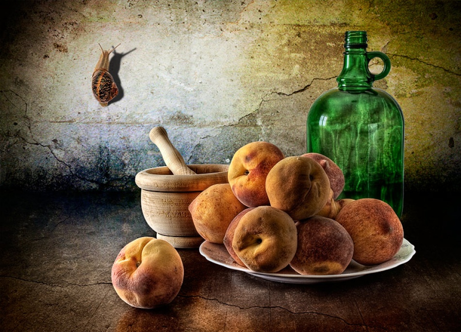
Glorious still life props: review on Still Life Photography
1x Blog-Tips & Tricks"From today painting is dead" French painter Paul Delaroche would have said when he saw the first daguerreotype. Well, he was too pessimistic. Painters never ceased to paint, but changed their style, acquired another way of seeing the world around them.
They turned away from that old tradition of representing the visible world so true to nature that you that you would like to pick a peach painted on the canvas to eat it. That fidelity is now left to the photographers who do it with gusto, whether it be portraits, landscapes or - and that's what counts in this review - still lifes
In French they call still lifes "nature morte", in Spanish "naturaleza muerta", in Italian it is "natura morta" - dead nature. The German equivalent is almost the same as the English: "Stillleben" - the Scandinavians use "stilleben" - and the Dutch first used the word "stilstaand leven" (stagnant life), but later on they switched to "stilleven". Anyway, whether you use the Roman variants of still life or the Germanic, everyone knows what you're talking.
Definition of a still life
There are several definitions of still lifes. Wikipedia defines it as an artistic composition of motionless and lifeless objects that are exposed with care. A painter concentrates on the composition and the use of colour and tone value, light and darkness. This definition mainly refers to the classical still lifes of the 17th and 18th century - think of Adriaen van Utrecht , Caravaggio and Jean-Baptiste Soméon Chardin and the work of the photographers who are inspired by them.
This definition excludes all still lifes that were made since halfway the 19th century - think of painters like Paul Cezanne, Vincent van Gogh and Giorgio Morandi or photographers like Rinko Kawanchi , Ori Gersht and Laura Letinsky .
I feel much more at home with the definition in Yvette Depaepe's compilation of the wonderful work of 1X still life photographers. I also very much like Francis Woodly's two definitions.
The first one is as follows: ‘A still life is a representation, a reflection, a transformation and a revelation of the objects around us’. For the second one he narrowed this down further to the representation of objects in space in relation to a surface.
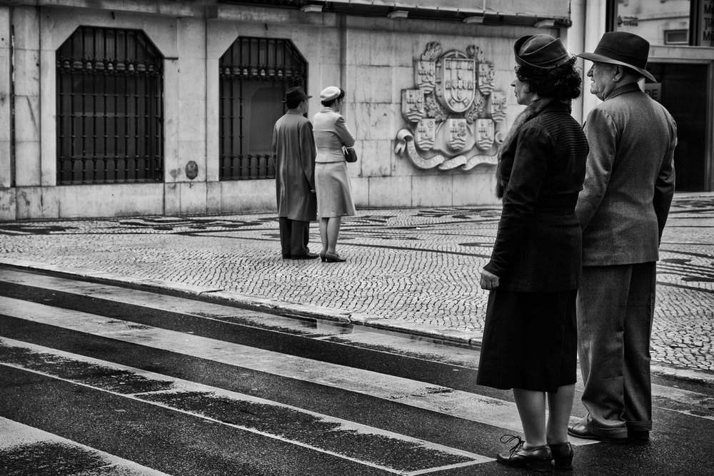
But you can expand the idea even further. Jackie Higgins does so in her book "Why it does not have to be in focus". In addition to traditional subjects such as flowers, food and nature morte, she also sees nudes and empty interiors as parts of the still life genre. I think even street still lifes may be counted in!
Over the long years the subjects of still lifes in both photography and painting became increasingly divers. I have chosen several topics out of this diversity:
1. The classical approach
2. Flowers
3. Humour
4. Food and drink
5. Black and white
6. The contemporary still life
1. The classical approach
Classical still life photographers are especially drawn to the paintings of the 17th and 18th century. It is the starting point for their inspiration and ambition to make balanced compositions with the ingredients as seen on the painting of their choice. They play with light, no matter whether it is artificial or natural, making an apple look as truthfully as possible as if it had been painted.
I'll show you two classical still lives. I can't imagine a greater contrast than between these two.
While Juan Luis Saco's photograph - Girasoles en la cocina / Sunflowers in the kitchen - is subdued and quiet, it is one and all baroque bustle on "Love Caravaggio" by Mystic Light.
Juan describes his photo as a classical still life with sunflowers presiding over the kitchen ... light and colour. It's a calm little scene. The colours are muted - what a difference with the vivid, brightly coloured sunflowers Tatiana Skorokhod which later discussed - the shadows are soft.
The kitchen seems to be in deep sleep. Together with the knife the ingredients for the next meal are peacefully waiting on the arrival of the cook. For a moment they are at centre of the stage - something which is characteristic for a still life, giving attention to everyday things like a beef tomato, a knife, a bowl with potatoes and onions, a flask of olive oil and flowers in a vase.
The light caresses the attributes on the table, which makes them so real and touchable, that I would like to grab that tomato and keep my hands. It reminds me of atmosphere of "Basket of Fruit" , an early work of the Italian painter Caravaggio, which is just like the photo of Juan characterized by modesty and restrained use of colour. There is yet none of the pronounced use of light and dark - the chiaroscuro, which was to become typical of Caravaggio's work and had the major impact on among others the Dutch painters from the time of Rembrandt. And it certainly inspired Mystic Light for his still life "Love Caravaggio".
While using Caravaggio's chiaroscuro, Mystic Light turned to the still life painters from the Netherlands for his composition. He had to, since there only three still lifes which are authentic Caravaggios.
Like many Dutch masters Mystic Light shows a table overflowed with fruit, vegetables, mushrooms and nuts. It could be he got his inspiration from a still life by Jan Davidszoon de Heem, who worked mostly in Antwerp (Belgium). In several ways Mystic Light's photograph resembles the painting.
Between brackets, there is nothing wrong with that. The American photographer Sharon Core for example meticulously restaged still lifes on canvas in her studio and photographs it. The result is so lifelike that you can hardly see the difference between photo and painting.
Back to Mystic Lights photograph and De Heems painting. Both have a dark background and the spotlight is on the fruits and the other food in all its lustre. Also the composition is quite similar. It is as if there is an imaginary line is drawn from the lower left corner to the upper right corner, and along which all the vegetables and fruit have been piled up. It gives the image a baroque liveliness which is also the characteristic of many flower still lifes by Flemish, French and Dutch masters from the 17th and 18th century.
2. Flowers
Many of you will know them, these lush flower still lifes by Flemish, Dutch and French masters of the 17th and 18th centuries. They are now a source of inspiration for photographers. They often put a lot of time making their compositions and a tool like Photoshop can then be indispensable. Photographer Bas Meeuws for example photographs the flowers he uses for his compositions one by one and in several positions, making sure that they all are lighted in the same way and then assembles them into a digital bouquet. Others, however, arrange flowers and other props around until they found the perfect composition in their eyes and then take their picture.
How Tatiana Skorokhod proceeds I do not know, as she doesn't describe how her pictures came into being. But looking at her portfolio I think she composed her still lifes in her studio.
Tatiana's composition is classical in structure, but its colours are much brighter and more expressive, It is actually less true to nature than those of Juan Luis Saca and Mystic Light. It gives the photograph a somewhat alienating, if not surreal effect which is enhanced by a modern blue scarf draped on the table.
While Tatiana's picture has many features of the classical still life, the work of Carlo Pautasso is the absolute opposite. His picture is minimalistic and is characterized by a great abstraction. He used only primary colours. Green, yellow, blue, red and white. Here is no room for a table with gorgeous flowers. No, there are only three humble daisies pinned on a plastic rope. An unprecedented small number for people who immediately associate the word flower still life with the lavish 17th century paintings. The old paintings especially evoke admiration, but Carlo's image makes you smile. It's a cheerful picture, expressive, witty and surreal. It really gives you that wonderful feeling of spring.
3. Humour
While preparing this review, I have saw a lot of still lifes - both paintings and photographs. They generally show a wonderful world of well-arranged food items, flowers, vases, glasses, musical instruments, skulls and so on. All of them are show-pieces and a showcase of the ingenuity and craftsmanship of the artists.
What struck me, however, was that only a few images made me smile. They are all so serious! Happily I could find some humorous still lifes. "Simply ... Spring" is an example, just as "Fish and violin" and "Misery".
A fish with a remarkable expression on its face, a violin, a magnifier and a ingenious stand. That's all you need to make a wonderful and funny still life photograph.
Starting point is the classical idea of still life painting - notably the chiaroscuro and the dark background colours. However, the fish hooked on a stand and its magnified face are a modern addition to the old genre. It is estranging, surreal and funny.
A still life can be very simple as Juan de Villalba's photo "Misery" shows. All we see is a part of a belt - nothing more and nothing less. A humble subject to photograph - but one of the essentials of a still life. And yet, it is much more than that. Just look at it and see: it is a belt no more. It is a face full of misery. It is so witty, so surreal and also so modern, as it is in line with the contemporary trends in the photographic still life - but more about that in a later paragraph.
4. Food and drink
Next to flowers, food and drink - including bottles, glasses and cups - are an important subject in still life painting and photography. The classic painters caught richly filled tables in gorgeous light. Modern artists like Giorgio Morandi painted in a more minimalistic and abstract way.
Christophe Verot's photograph reminds me very much of the low-key and almost monochrome still lifes by the Italian painter Giorgio Morandi, who surely has been a source of inspiration.
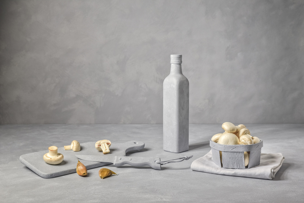
Geometry is the key of Morandi's work and Christophe's. They are moreover characterized by their deceptive simplicity, stillness and contemplative atmosphere. Christophe's image has however an austerity that is lacking in Morandi's still lifes.
In his description Christophe wrote that he used hand prepared objects and painted the background in the same colours. The natural vegetables form a soft contrast with the shades of grey. In his own words: "A personal and minimalist vision of a traditional subject. "
"Broken cup" by Diana Lysenko is as extravert as Christoph Vermont's "Recipe no 1 is introvert. There is no stillness in Diana's still life. On the contrary! With this imagination of an accident in the kitchen, Diana breaks through the static that characterizes many still files. She brings dynamism into her image, showing what happens when you cup falls from the table, which makes her photo playful, light-hearted and cheerful.
5. Black and white
There are relatively few photographers who use black and white for their still files, which are usually identified with colourful images. So I was quite happy to find two wonderful ones in black and white.
A table, part of something that could be a chair and at the corner of the table a fruit I can't identify - which, as a matter of fact, is of no importance. What is matters is the self-willed interpretation of the food still life genre.
It is an exciting composition, in which straight lines and curves are decisive. And yet, it is about something completely different. The barren setting of this image seems to tell me a story of solitude and contemplation. This could be the sound of silence.
A gnawed fish on a plate - that's all, but beware. Looks can be deceiving! This fish is not just a fish; it is an ancient symbol of Christianity - the title of the picture refers to it - and in this still life, he symbolizes the crumbling Christianity. At least, that is how I read this clever minimalistic image.
Between brackets, a fish like this can also represent the vanillas theme. You see it quite often on the Dutch still life paintings of the 17th and 18th centuries and it symbolizes mortality. I am sure you know them, those paintings with skulls, withered flowers, rotting fruit, chopped bones, fish gratings, and so on.
6. The contemporary still life
Today, many traditional still files are still being made, but there are also photographers who are taking other directions. The Danish-Swiss duo Ulrich Martin Larsen and Stephan Fried - working under the name PUTPUT - for instance photographs playful but transient constructions and so transforms the ordinary into the extraordinary. Their photography is influenced by Pop Art and surrealism, they use bright colours, they are funny and there is hardly any trace of chiaroscuro. One sees those characteristics also in the work of Krista van der Niet or Laura Letinsky and of the two 1X photographers Michelle Degryse and Hamid Hanjar.
I had no idea that the film maker Agnes Varda was also a photographer - and a very good one indeed! She seems to have a soft spot for potatoes and that inspired Michelle Degryse to make her potato still life.
The photo has all the characteristics of the contemporary still life. It is surreal, has a touch of Pop Art and the colours are bright. She makes the ordinary potatoes into something noteworthy. You have to look at them. How many times do we look at potatoes? Not all to often; well, we do when we peel them, but we don't really see them.
Hamid Hanjar made a completely different still life with the characteristics I just mentioned. He really had a brilliant idea, when creating a colour mixer out of his kitchen machine and turning it into a wonderful modern still life. The tool and the wool were made into something special. In way this was of course also the idea of the classical still life - giving attention to everyday things one never notices properly, but it was more a collective attention since there were so many things on the table. With Michelle and Hamid the insignificant object gets all the glory for itself.


