Tips & Tricks
"Daydreamer": Review by the Senior Critic Team
1x Blog-Tips & TricksPublished by Yvette Depaepe in collaboration with Alfred Forns, Head of the Senior Critics
1x has a unique feature the founders are very proud of: the photo critique. Members can submit pictures to a team of knowledgeable senior critics. Their feedback is useful, interesting and enriching even for the best of us.
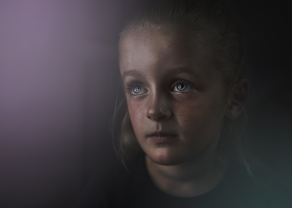
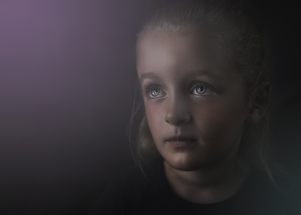
Critique on the photo ”Daydreamer” submitted by Dominic Schroeyers.
___________________________________________________________________________
Original photo submitted to the Senior Critic Team
I'm trying to learn a bit more about external flash photography. I have to do it by trial and error. This is one of the pictures that – in my humble opinion - is not too bad concerning the lighting. I find it hard to get a good balance between the natural light and the flash light. The darkness was almost complete in the room when I took this portrait. The problem then is that the skin easily looks shiny. In this particular case it was very hot so my little model was sweating too ;-)
How can I avoid the fat/sweaty looking skin when using a flash (even if the model is not sweating)?
I added some coloured light in post-processing. I thought it would add a bit of a dreamy touch. At least, that was what I thought.
What do you think about the added light?
Any other things to watch out and how can I improve this portrait?
____________________________________________________________________________
Senior Critic Javier Roldan
I'm not expert in studio lighting, but have you used a softbox or something similar? If not, I'd suggest it straight away.
If you ask about softness in lighting, that's one of the answers, and get it quite close to her. I found this Lynda tutorial amazing regarding introductions to shooting with flash.
To me this is a nice portrait. I like the concept and colours. Composition wise, I'd shift it a bit more to the right side, from a viewer's standpoint. With regard to treatment, my only objection is I think you've gone too far with the haze, which almost eliminates all details in her hair, mainly on the top-right. I'd limit the haze to the top-left and bottom-right corners but still leave her head with a bit more contrast; you don't need to add too much contrast so you keep the mood, but just prevent too much haze.
Something I think you could do is softening her skin on the forefront.
An excellent tutorial to do so is this one from PHLEARN.
You certainly have the foundation of a nice, atmospheric portrait with a wonderful expression and excellent model!
Dominic Schroeyers
Yes, I used a small softbox (60x60). It was placed just outside the camera view, so fairly close to her.
With haze, you mean the added color, or the blur on the hairs? The picture is taken with a shallow DOF and with no light at that side of her head. Together with a vignette may have resulted in loss of detail in the hairs. I'll try to recover some in a updated version.
I had tried frequency separation in the past, but found it to be a hassle, but I was looking to the instructions in your link and what a difference! Thanks a lot. I have learned something new again. I'll post an update soon.
____________________________________________________________________________
Senior Critic Lyn Hungerford
The eyes are just beautiful!
Javier already commented on the haze, which I too find excessive - but I think the light and colour contrast are very good.
A useful tip for reducing shininess in Adobe Raw is to work in the colour section particularly with the saturation slider - skin generally responds to orange as well as reds - but you might try the yellows too. This way you can selectively reduce the shininess.
The expression of your little model is beautiful but I think the concentration of light on her forehead is creating an unnatural look as well some distortion. I would definitely soften the forehead in this image.
Looking forward to seeing any modifications.
Dominic Schroeyers
Great tip with the color saturations! This combined with the frequency separation is resulting in a way better look of the shiny parts on the skin.
I am working on a updated version as we speak, trying out the tips you and Javier gave me and I think it already looks way better.
____________________________________________________________________________
Senior Critic José Hernán Cibils
The picture is nice, I like the pose, the eyes, the light (except maybe a little on the forehead), the shadows and the effect of dissolution. The girl is indeed not “anywhere”, she is floating in a kind of cloud. Therefore, the title is very adequate. The only suggestion (in my subjective and personal opinion) could be that the lila color on the left is too intense.
The tones of the face are (for me) also too pronounced, although they are very expressive, very "Dutch", if I may say that...
But I agree with previous comments, maybe it would be better to play with the sliders and the saturation to find the right balance. A B&W version is not an alternative, I guess...
Dominic Schroeyers
I agree with your arguments and had already uploaded another version to my page with the suggestions given. I have a black and white version too with another edit, maybe I'll give that one a try later too.
. '

