Tips & Tricks
In the Swimming Pool
1x Blog-Tips & Tricks' .
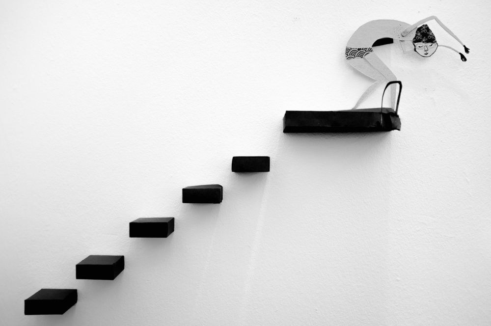
This idea suddenly came to me after studying the work of Madoz and Garcin. Their stylistic, aesthetic approaches to photography create relationships between figurative and actual events through projects they develop, designed to make us believe in the realism of their contents. I was inspired, so in my image “In the Swimming Pool,” I tried to convey feelings of freedom, pleasure and healthy living through an illustrative, graphical representation.
The photo shoot was planned and executed one afternoon. After establishing my initial concept, I envisioned a scene that would incorporate the feelings that I wanted to portray in the image. I constructed the set using sheets of cardboard for the steps and glued them to the wall. The illustration of the swimmer was created by my daughter after I explained to her what I was trying to accomplish.
Once the scene was assembled, I set up my camera and tripod directly in front of the wall and at eye level. From that angle I was able to have sharpness throughout the scene, avoid distortion in the horizontal and vertical lines and give depth and dimension to the steps.
I shot the image with a Fujifilm FinePix X100 and a Fujinon Super EBC XF 23mm aspherical lens. I set the camera to Aperture Priority mode, the aperture to f/2 and the ISO to 100. I did not use a flash, but I handheld the camera and shot this image at 1/40 second shutter speed. The 23 mm focal length allowed good sharpness throughout the scene, even with the wide aperture and fairly slow shutter speed that I used. The natural light in the room, and the fact that it also bounced off the other walls in the room, provided a smooth and uniform illumination, so there was no need to use a flash. The exposure time of 1/40 second was not an issue because there was no motion in the scene.
It's a humorous picture that simultaneously transmits peace and quiet, and that is exactly what I set out to achieve.
. '
After viewing the work of two surrealist photographers, Chema Madoz from Spain and Gilbert Garcin from France, I tried to convey feelings through an illustration that depicts the sensations of freedom, pleasure, freshness and healthy lifestyle.
This idea suddenly came to me after studying the work of Madoz and Garcin. Their stylistic, aesthetic approaches to photography create relationships between figurative and actual events through projects they develop, designed to make us believe in the realism of their contents. I was inspired, so in my image “In the Swimming Pool,” I tried to convey feelings of freedom, pleasure and healthy living through an illustrative, graphical representation.
"The illustration of the swimmer was created by my daughter after I explained to her what I was trying to accomplish."
The photo shoot was planned and executed one afternoon. After establishing my initial concept, I envisioned a scene that would incorporate the feelings that I wanted to portray in the image. I constructed the set using sheets of cardboard for the steps and glued them to the wall. The illustration of the swimmer was created by my daughter after I explained to her what I was trying to accomplish.
Once the scene was assembled, I set up my camera and tripod directly in front of the wall and at eye level. From that angle I was able to have sharpness throughout the scene, avoid distortion in the horizontal and vertical lines and give depth and dimension to the steps.
"The natural light in the room, and the fact that it also bounced off the other walls in the room, provided a smooth and uniform illumination, so there was no need to use a flash."
I shot the image with a Fujifilm FinePix X100 and a Fujinon Super EBC XF 23mm aspherical lens. I set the camera to Aperture Priority mode, the aperture to f/2 and the ISO to 100. I did not use a flash, but I handheld the camera and shot this image at 1/40 second shutter speed. The 23 mm focal length allowed good sharpness throughout the scene, even with the wide aperture and fairly slow shutter speed that I used. The natural light in the room, and the fact that it also bounced off the other walls in the room, provided a smooth and uniform illumination, so there was no need to use a flash. The exposure time of 1/40 second was not an issue because there was no motion in the scene.
It's a humorous picture that simultaneously transmits peace and quiet, and that is exactly what I set out to achieve.
POST PROCESSING
I used Adobe Lightroom 5.3 to process the image.
There are a few options in Lightroom to consider when you are planning to convert a color image to black and white:
• In the HSL/Color/B&W panel, you can desaturate the image by selecting B&W and then adjusting the individual color sliders until you are satisfied with the results. Afterward, you can increase the Saturation and Luminance settings and then adjust other settings, such as Exposure, Contrast, Blacks, Whites, Highlights, Levels and Curves.
• You can apply a yellow or red filter preset. In this case, it would darken the blue stripes in the swimsuit and lighten the yellow stairs and red bathing cap. With this method the yellow stairs would lose prominence and impact, and that was not ideal since they are one of the key elements of the composition.
• You can apply a blue filter preset, which would do the opposite of the yellow or red filter preset. It would darken the yellow stairs and the red bathing cap and lighten the blue pattern in the swimsuit.
• You can also export the image to a plugin such as Nik Silver Efex Pro 2 and conduct the black and white conversion there.
After analyzing the photo and considering my options, I realized that the best method in this case would be to apply the blue filter. These filter presets are available to download and import into Lightroom.
1) After applying the blue filter preset, the image was dark and had little contrast.
2) In the Basic panel, I moved the Whites slider from the default setting of 0 to +38, which brightened the white wall. This did not give the wall a pure white appearance, though, so I returned to the default settings in the blue filter preset and changed the Highlights setting from –50 to +94. Now the whites were pure white, but there was no clipping in the brightest areas.
3) After adjusting the Whites and Highlights, the image lost contrast, so I increased the Contrast only in the stairs. This gave some punch to the stairs while the white wall remained white and did not lose any shadow detail.
4) The stairs needed even more contrast, so I returned to the blue filter settings and adjusted the Blacks default setting to –7. In the Basic panel, I decreased the Blacks, moving the slider to –94. This really improved the contrast and the impact of the stairs, but it created some clipped (too dark) areas in the blacks.
5) In the Tone Curve panel, I set the black point of the curve to +4 to repair the clipped areas in the stairs. Now the image had good tonality throughout, with no clipping at either end of the histogram.
6) I then worked on the pattern in the shorts. Originally the design was blue, but after applying the blue filter in Step 1, they became almost transparent in the black and white version. I needed to put some tonality back into the blue stripes. In the HSL panel, I moved the Blue slider from +63 to –1 and the Aqua slider from +38 to +30. This worked perfectly and now the pattern was much more apparent.
7) To further enhance the contrast in the stairs and the red bathing cap, I made a few more adjustments in the HSL panel. I decreased Yellow from –60 to –84 to improve the red tones in the bathing cap, and to improve the contrast in the stairs I increased Green, moving the slider from –7 to +11.
8) Using the Spot Removal tool, I removed some dust spots from the stairs.
9) Finally, in the Detail panel, I applied Sharpening: Amount 25, Radius 1.0, Detail 25 and Masking 10.
TIPS
1) Search for simplicity. Look around for areas that are more minimalistic and less chaotic.
2) Look for parts that represent the whole; the whole often leads to disappointment. Keep an eye open for patterns, shadows, repetitive shapes, color contrasts, and so on. When you are composing your images, pay special attention to the edges and corners of the frame.
3) Look for objects with potential — don't look for great photographs.
4) Maintain a positive attitude. Open your mind to see something new and creative.
5) Explore: Put your camera down and study the scene without it. Move yourself. Go low, go high, look around, look inside, change your viewpoint, look at the scene from every angle and bend your knees.
6) Stop: If you have explored the area for a while and have found nothing interesting to photograph, just stop. Go home and come back again another day to look at the scene with fresh eyes.
7) Deal with disappointment. This is a very, very personal issue, but you have to think about photography as you think about life: a little rain makes you appreciate the sunny days even more. Learn from your experiences.
BIOGRAPHY
I'm Portuguese, and I live in the center of the country, close to Viseu. I work with the National Health Service as a family physician. I started my photography hobby with an analog camera, later crossing over to digital format. I learned about photography by reading books on the subject, observing works of major authors, consulting specialist journals and reviews, and joining sites on the internet, such as 1x.
I prefer to photograph architecture and architectural design, conceptual and street photography. I am always looking for contrasts, shapes, patterns, and the play between light and shadows, and I want to convey to others what I feel when I photograph.
I prefer to photograph architecture and architectural design, conceptual and street photography. I am always looking for contrasts, shapes, patterns, and the play between light and shadows, and I want to convey to others what I feel when I photograph.


