Tips & Tricks
Senior Critics Review on "The Pale Approach" by Marc Petzold
1x Blog-Tips & TricksPublished by Editor Yvette Depaepe in collaboration with Theo Luycx, Head of the Senior Critics
1x has a unique feature the founders are very proud of: the photo critique.
Members can submit pictures to a team of knowledgeable senior critics. Their feedback and different suggestions are useful, interesting and enriching even for the best of us.
Every month, two well-known 1x photographers will lend their “expert eyes” to members, providing new opinions, expertise across a diversity of genres, and photographic wisdom and insight.
Guest Critics for April are: Jose C. Lobato and Martin Zalba.
Critique on the photo ”The Pale Approach” submitted by Marc Petzold
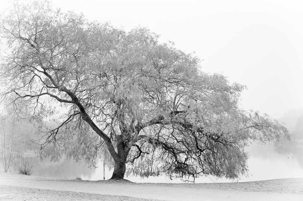
I personally do like this tree, sadly, it was years ago... it doesn't look right now to me, like it is. But I wanted to capture this eerie like feeling, the mist, the solitude and this tree standing at the lake on a foggy day.
I can hardly express my feelings, sorry. I hope you do like it.
I am not good at explaining what & why I do things. I need my specific via headphones, I need it to be silent and calm to work on the pictures I have in mind.
I hope you guys will understand me a bit.
__________________________________________________________________________________
Senior Critic Victor Mozqueda
This image looks minimalistic and does bring the feel of solitude as you have mentioned in your description,; Marc. Thank you for sharing this lovely image and giving us the opportunity to express our opinion.
I believe the black and white tonality is pleasing as well as the composition.
I can see the dark branches in the middle of the tree. The angle chosen also shows the branches which are not covered by foliage. The contrast between them works beautifully.
Looking at the base of the tree trunk, my attention is distracted by the nearby signage and I think this can be a bit distracting. It is not “too” distracting but could easily be cloned away to have a cleaner image.
Since this pole is the only hard/dark visible straight line in this capture, it easily hits the eye of the viewer.
But overall, a wonderful shot, Marc!
Marc Petzold
Thanks for your thoughts, Victor. I hope to find back the RAW file – really old one – to make some slight changes to the overall composition.
__________________________________________________________________________________
As I said in a previous comment, it would be better to include the shooting settings and gear used, as it allows for a better critique and for others to learn.
This is an image full of sensibility. I like the tree very much and also the processing you've done. This could be as well a landscape or mood photo. I'm not a landscape photographer but would still like to drop a few comments.
There are a couple of things I'm not sure about. First is the tones of the leaves. The ones in the bottom-right corner appear darker than the rest of the tree. Have you lighten all leaves except for those at the bottom? If so, I'd lighten those at the bottom too.
From a composition point of view, this one is OK but I feel the white in the top-right corner is too harsh and without detail, not matching the light grey in the background behind the tree. If you have whiten that part, I'd lessen the effect. Otherwise you could add a light texture to the image that would help blending everything.
There are some other aspects like the white vignetting that I wouldn't do, and the crop, where I'd expand it a bit to make sure I include the tree entirely, as there are branches on the left and top that go beyond the frame.
Finally I'm wondering if changing the format to 16:9 and adding some more room on the right side would be better, as I'm not too convinced about having the trunk neither in the centre nor in the strong left vertical. More space on the left, letting us see the landscape there, could add depth and let the tree "breathe".
This is just my personal opinion. Beautiful image anyway.
Marc Petzold
My screen is colour-calibrated. I have made several versions of this particular tree. Yes, the leaves are stronger at the right side. I didn't noticed that when post processing.
May be because, I did it some years ago, and also because recently I'm wearing glasses now. About the surroundings of the lake, they didn't seem interesting to me and therefore I focussed mainly on the tree. About cropping the original picture, well I rarely crop my pictures, only in 5% of the cases.
Thanks a lot for your insights, Javier.
__________________________________________________________________________________
Guest Senior Critic Jose C. Lobato
You're bringing us a beautiful, elegant and very tasteful image here, Marc.
The overall idea seems right to me. The tones of the tree, the leaves and the trunk seem OK to me except for the leaves on the right and lower side. They look somewhat underexposed., where they seem underexposed somewhat.
I would have darkened the ground a bit, since I think it mimics too much with the rest of the scene. That would give more relevance to the tree, of course, a very personal opinion.
I would also have left some more space all around the tree, especially on the left side where it seems to be more compressed.
Finally, as Victor pointed out to you, I would also eliminate the signal that is almost hidden among the foliage, although it can clearly be seen. A simple cloning should be sufficient to create a more cleaner scene.
For the rest, there is nothing else except to congratulate you with this excellent and tasteful work, Marc.
__________________________________________________________________________________
Senior Critic Norman Gabitzsch
I really like rugged old trees displaying great character and this is a beauty. The high key tone and the dark trunk lends itself well with a minimalistic black and white. I think you have done some work to isolate the tree and it pays out nicely.
I would like you to try some experiments to see if you can isolate the tree even more. My points are all very subtle refinements that I think might make this an even more memorable image.
First: the slightly darker trees and reflections in the water on the left side catches my attention when it shouldn't. Normally, bright objects are the distraction but in this case (for the high key work) the darkness becomes my distraction. I would dodge these darker background elements.
The shore line on the right fades out against the right edge. I would burn (darken) the grass on the right edge to keep the contrast of the shoreline grass constant. I also should try the same thing on the left edge (but this is harder because of the branches and bush). Of course the vertical pole is a small distraction as has already been pointed out.
Finally I would consider make the mid and higher branches darker so that the structure of the tree shows off better.
This is wonderful material, Marc.
Just a few more tweaks and you will have a memorable image.
__________________________________________________________________________________
Guest Senior Critic Martin Zalba
I fully agree with the observations my colleagues made, especially regarding the frame. I also think that the tree needs more space in the image since the margins compress it and it gives a certain overwhelming feeling. For the rest, I think it's a great picture.
Critique is also open to all members, and we learn together here. If you see an image you'd like to comment on, your words would be welcome.

