Tips & Tricks
Senior Critic's review on 'Calm after the storm'
1x Blog-Tips & TricksPublished by Yvette Depaepe in collaboration with Greg Barsh , Head of the Senior Critics
1x has a unique feature the founders are very proud of: the photo critique.
Members can submit pictures to a team of knowledgeable senior critics. Their feedback and different suggestions are useful, interesting and enriching even for the best of us.
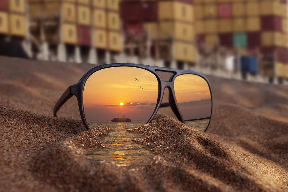
Critique on the photo ”Calm after the storm” submitted by Angelo van der Klift
This is a composite I made for a client in the insurance industry.
This picture should image one of the products they sell in transport insurance. They wanted something different than the usual stock images.
It was difficult to make. The the light came from the right, but I also had to mimic the light from the front, as it should not represent a reflection light, but a direct light from the sun in the front. So I had to dodge and burn the sand piece by piece. And had to maintain the depth of field in the water that came out of the glasses, so that it matches the dof of the sand in the front. Any other suggestions? I used Photoshop only.
__________________________________________________________________________________
Senior Critic Andreas Agazzi
I like especially the sharp image in the glasses and the water that goes trough it. There is a very nice and calm mood, awesome colour toning and light. The overall depth of field works quite well for me, it creates depth out to the sea and the ship. I think that everything in the glasses, but also the sand itself, are beautifully crafted.
The background with the containers distracts in my opinion. It looks to vivid but what I consider to be the strongest distraction are some areas that are too bright.
Just above the glasses are some elements, probably pillars of steel, that gets unnecessarily viewers attention. There is also kind of a reflection in the upper right quadrant.
I recommend to darken the whole area where the containers are quite a bit so that the main attraction, the glasses, gets full attention.
Otherwise I don't see any need to get something changed. Cool work Angelo!
Angelo van der Klift
I get your point about the background. I actually have tried several different backgrounds. Most of them fit perfectly, but look a bit too perfect. I wanted to give this image more than a wow effect, by distracting from the surreal part of the image (the water coming out). This one got me the most comments such like "wow it took me 3 seconds to spot the water coming out, so nice" etc. For me that did the job. So, in short, I had to decide weather I took all distractions away, or leave a bit of distraction to enhance the wow effect. What are your thoughts about that issue?
Senior Critic Andreas Agazzi
For me, the photograph would work also without a deliberate distraction.
It depends whether your client deals with insurances for freight or general transportation, thus also travellers.
Another question that I have asked myself was how your title 'Calm after the storm' can be associated with the image.
There is no obvious sign of storm if you look at the image. In other words, if you are looking for a composite and that's the title you want to keep, I would rather expect to see dark and dramatic clouds in the background, but with the same image and mood in the glasses and foreground. You might even add lightnings in the background. This would also create a strong visual contrast. Just as an idea.
Angelo van der Klift
Andreas I understand what you mean with the title. Maybe have to reconsider that one :)
__________________________________________________________________________________
Member Bjorn Emanuelson
I like this image a lot. Great idea - thanks for posting! The lower part of the image with the sunglasses, sand and the ship and sea all are very nice and creative with lovely colours and light.
I agree with Andreas that the background is the weak part of the image. The bright parts and some bright coloured containers grab too much attention making the background a bit distracting.
Maybe it would be possible to find a background with just a few, evenly coloured containers. But as said, a great idea and well performed!
Angelo van der Klift
Thanks for your criticism on this image, Bjorn! I refer to my reply to Andreas. I think you really got a good point about the brightness of the containers. I haven't thought about that in this process.
__________________________________________________________________________________
Senior Critic Johanes Januar
I'm happy to see this great photo in our critique forum. When I first saw this image in the members curation, it really caught my attention for the end and clicked right away on the “Publish” button.
This shot is outstanding. My opinion is very similar to the one from my colleague Andreas.
After reading your information, I truly believe that your client will be happy with the result!
It looks very professional to me in terms of – idea, the message, an great photographic display as sharpness, composition and colours.
The image reflected looks like the water is flowing out of the glasses with a wonderful golden colour on the sand exposed to the sun.
What seems difficult to me is to have a straight horizon in that reflected image.
The left side gets aligned with frame of the glasses and the line of the containers on the background.
This are my positive remarks on how you put a maximum of work to realise this great shot. You made a meaningful image with an obvious message. My personal congratulations to you, Angelo!
Angelo van der Klift
Thanks a lot for your kind words, Johanes. It took me three attempts to get the horizon right. I even had to go back to the beach to pull some of the sand away as if there was already water coming out. That made the difference with the end result. :)
__________________________________________________________________________________
Senior Critic Martin Zalba
Thank you very much for sharing your photo. You have developed a great idea! I like it very much. I agree with my colleagues that the fund still has a lot of weight in photography and although it helps to place it on the beach, I think it still weighs a lot.
I would try to cut it a bit and clone the blue container on the right, which distracts a bit.
Another aspect that I would have liked more, is that the blur on the foreground is very big. I suppose you did it while processing. If so, it would tend to blur more gradually: from less to more, from the foreground to the bottom. In that way the photo would gain in naturalness.
The blurring of the foreground seems excessive to me and removes visual quality. But all this is from my personal point of view, always subjective ;-)
Angelo van der Klift
The blur on the bottom was actually already there in the original. If you want you can see the original image on my blog: http://photography.angelovanderklift.com/calm-after-the-storm/
Critique is also open to all members, and we learn together here. If you see an image you'd like to comment on, your words would be welcome.
. '

