Tips & Tricks

How to Use Vibrance in Portrait Photos With Lightroom Classic
Tuts+PhotographyGetting the colours just right in your photo can be difficult. There are so many variables at play while editing that can effect the brightness of your colours, the density of your colours, and the saturation of your colours.
In this tutorial, you'll learn how to use the Vibrance adjustment in Lightroom Classic to get the colours just the way you want them in your next photo edit.
What is Vibrance?
It's worth keeping in mind as we move through this tutorial is that colour is subjective. There are no right or wrong answers as to what colours 'should' look like, instead, there are infinite variations on what the colours 'could' look like.
Maybe you've played around with the vibrance and saturation sliders in Lightroom and wondered what the difference was between the two. It can be easy to use them almost interchangeably, that is, until you find yourself editing a portrait.
Vibrance is a kind of 'smart saturation' that allows you to effectively increase or decrease the saturation of colours in an image without creating unnatural or oddly saturated skin tones. Like saturation, vibrance can increase or decrease the relative saturation levels, but it works with more precision and nuance.
How to Use Vibrance
The vibrance adjustment adds or removes saturation from the less-saturated colours, while keeping already-saturated colours relatively untouched. The effect tends to impact the cooler colours, such as blues and greens, while 'protecting' warmer colours such as reds, oranges, and yellows. This is significant because skin tones almost always fall in the warmer colour range.
Let's put this tool to use and learn how it works.
First, locate the Vibrance adjustment in the Adobe Lightroom. You'll find it in the Develop module, at the bottom of the Basics panel, under the header of 'Presence'.
Like most adjustments in Lightroom, the vibrance adjustment comes in the form of a slider. This makes it incredibly easy to use, and allows you to see the results of the adjustment in real time. Pull the slider to the right for increased vibrance, and pull it to the left to decrease the amount of vibrance.


The Effect of Vibrance
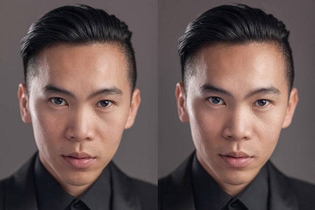
Let's apply some vibrance adjustments to an image and see how it affects our colours. Here's a portrait, where on the left is the RAW image, and the right has an adjustment of +50 Vibrance.


Here again, the left is the RAW image, but now the right image has an adjustment of -50 Vibrance.


Notice how even at these rather extreme movements of the slider, the skin colour still looks quite good. This is because of the AI built into the vibrance adjustment protecting the warmer tones.
Give Vibrance a Chance!
Play with the Vibrance and Saturation sliders on your own photos. What happens if you make a hard reduction on vibrance and an equal positive adjustment on saturation? And the other way? In combination, these two tools can give you a lot of precision in colour and tone.
I hope this has helped you to better understand the vibrance adjustment in Lightroom. The next time you go to edit a photo, play with the vibrance slider before making any other colour adjustments and see with your own eyes just how useful this tool can be.

 PhotographyThe A-Z of Adobe Lightroom Classic for PhotographyJamie Evan
 Photography10 Top Landscape Photography Lightroom PresetsDuncan Clark
 Colour CorrectionHow to Use Creative Color Curves for Expressive Images in LightroomAndrew Childress
 PhotographyHow to Use Curves to Change Contrast and Tone in Photos With Lightroom ClassicAndrew Childress