Tips & Tricks

How to Create a Signature Look for Your Photos With Lightroom Classic
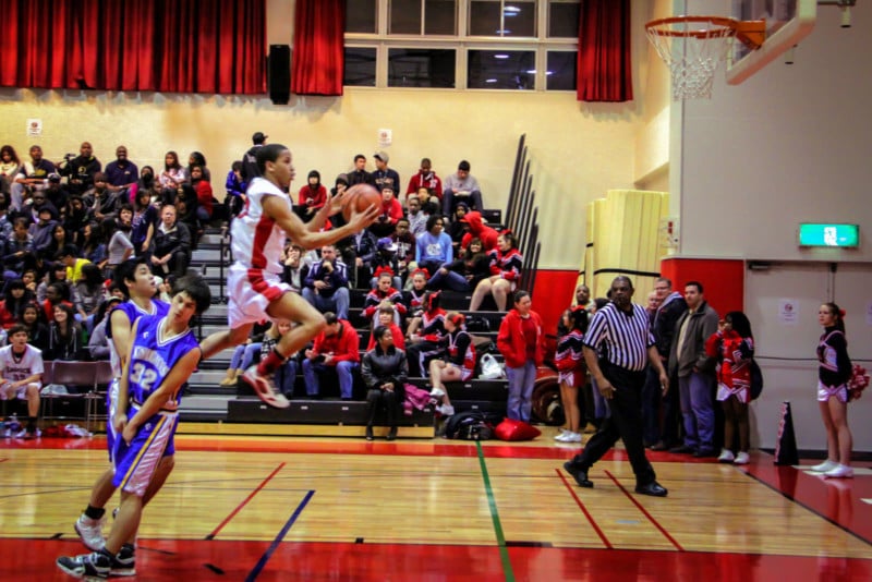
Tuts+PhotographyIf you follow photographers on social media, try this out: open your favorite app, start scrolling, but try not to look at who posted the photo. Now, try to guess the photographer behind each image.
It might be easier than you think, thanks to each photographer's signature look. A signature look is the repeated combination of shooting and editing techniques used in a collection of photographs, like a portfolio, book, website, or social feed, to create recognizable continuity, perspective, style, and cohesivenes between the pictures.
For photography clients, both the ability to reliably recreate a signature look and the flexibility to adapt the look to new situations are important. Finding a look or creating a new one is also a pretty fun process, one which can and should grow with your photography.
Every photographer wants to build a style that stands out from the crowd. In this tutorial, you'll start the journey of creating a look that's all your own. You'll also learn how to create and save styles in Adobe Lightroom.
What to Do Before You Apply a Look to Your Photos
The image adjustment process consists of many steps. In general, I like to break it down into two key stages:
- Corrections bring an image back to a neutral, balanced stage. This means the basics of adjusting an image to a "close-enough" exposure without applying an opinionated, creative style to the image.
- Creative adjustments are where your vision as an editor can set you apart. These are the adjustments you make beyond the neutral corrections to bring an image to your final creative vision.
Before you begin to apply creative adjustments, it's essential that you correct your images. At Envato Tuts+, we've developed a series of tutorials that help you do just that in Adobe Lightroom.
Check out our tutorials on image correction below. Apply these steps before you move onto developing your signature style.
 How to Correct Exposure in Photos With Lightroom Classic: Basic Method
 Andrew Childress30 Jun 2022
 How to Correct Tone and Contrast in Photos With Lightroom Classic
Andrew Childress28 Nov 2022
How to Correct Tone and Contrast in Photos With Lightroom Classic
Andrew Childress28 Nov 2022
 How to Fix Over- and Under-Saturated Photos Using Lightroom Classic
Andrew Childress13 Jul 2022
How to Fix Over- and Under-Saturated Photos Using Lightroom Classic
Andrew Childress13 Jul 2022
 How to Correct White Balance in Photos With Lightroom Classic
Andrew Childress30 Jun 2022
How to Correct White Balance in Photos With Lightroom Classic
Andrew Childress30 Jun 2022
How to Study An Image For Style
You might not have developed what you consider to be your signature style yet. Maybe you're not sure what you like, or what your style consists of.
The best part of being a photographer is that you don't have to figure it out on your own. You have many years of talented photographers who came before you, blazing the trail of creative editing styles. Look to them, learn from them, and study their look as you think about developing your own.
Let's divide a photographer's signature look into two parts: how the image is created, and how the image is edited and adjusted.
Study How An Image Is Created
As you start learning photography, you might know that you love a picture when you see it but you can't yet describe why. It stands out in your feed. You might pause and save it, and use it for inspiration. But you're still not sure what sets it apart.
When you're growing as a photographer, there's this magic moment that marks your growth. You begin to study photos and zone in on what you love. You start to define specific parts of a photograph that make it resonate with you and develop the mind's-eye-to-language connection needed to describe those images.
Photography is of course an art, but there's also a scientific element to it. When you learn what you like, you're able to replicate it in your own work. Here are a few factors to analyze while you're studying an image:
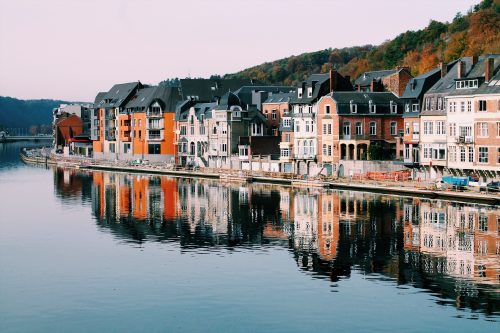
- Composition: how does a photographer tend to compose their image? How do they arrange the combination of subjects and objects in a way that leads the eye? For example, does your favorite photographer have a lot of photographs where the subject is at the center of the frame, or do they maybe use geometry to make a different kind of composition?
- Lens choice: this is related to photo composition, but most photographers have go-to focal lengths. A photographer who enjoys wide-angle might focus on putting their viewer "inside" a frame, while telephoto shooters might point an observant eye from afar.
- Lighting: Here's an example. My favorite photographers focus on natural light portraiture. Their work is very different than studio-based photographers that use strobes and light modifiers. Why?
Here on Envato Tuts+, Dawn Oosterhoff published an in-depth tutorial about studying images and "reading" them for their real meaning. Dawn's tutorial focuses on interpreting a photo, studying the image for composition and finding a deeper layer. Make sure to read it to learn more:


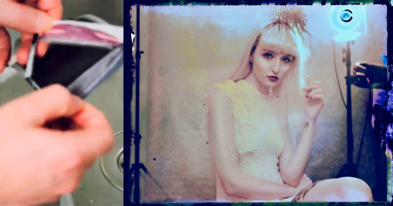
Study How An Image Is Edited And Adjusted
Now, it's time to turn our attention to Adobe Lightroom. Let's review image examples, then link to tutorials that help you implement the same in your photographs.


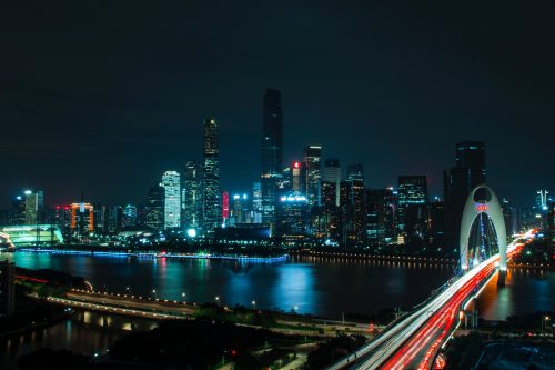
Creative Color
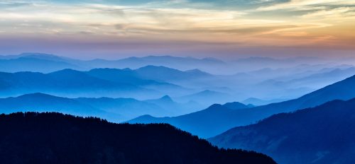
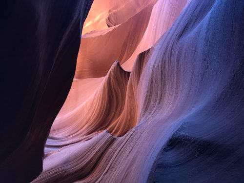
If there's one factor that photographers use to set themselves apart, it's creative color adjustments. As you watch your favorite photographers' sites and social feeds, study the familiar objects in the frame, like grass or a body of water. Does the color match the real-life rendering, or has it been adjusted? These are good indicators that some creative color is a part of a photographer's signature look.
Learn how to create custom creative color looks in our tutorial:


Creative Contrast
Contrast is part correction and part creative adjustment. After an image is brought to a neutral state, many photographers will leverage contrast again as part of more creative adjustments.
This creative adjustment is more popular than ever, largely due to the popularity of film-style edits. These images use lower contrast for a vintage and classic style.


Of course, your creative style can also include a high contrast creative adjustment. This is useful for dramatic images that seek to draw focus to a more limited part of the image.
Get creative with contrast with the help of our tutorial:


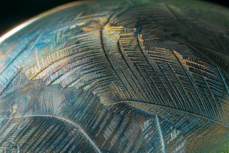
Detail and Texture
While some photographers opt for sharp, detailed, textured photos, others will opt for ethereal edits. Collectively, this choice is about how much detail you want your images to include.
Detail is all about how you lead the viewer's eye through the image. Adding detail and sharpening, particularly to your focus areas, helps to naturally guide someone to see what you see. Negative adjustments that remove sharpness do the same thing in a sense by de-focusing parts of an image.


These are just a few of the factors to consider while you build your signature look. Think about the type of style you want your photography to convey, and then spend time experimenting in Adobe Lightroom.
Learn the art of adjusting detail to softer, less detailed images with this tutorial:


How to Save And Share Your Signature Look With Adobe Lightroom Classic
After you've developed your signature style, it's a great idea to save your adjustments to apply to images in the future. While every image requires a unique approach, the common parts of your signature look are universal.
It helps to save these adjustments as Lightroom presets. Not only does it save time while you're adjusting the image, it also ensures consistency.
After you apply adjustments to an image, it's time to save your Lightroom preset. Click the + button, then choose Create Preset on the Presets panel.


Now, you'll see a new window with labels for every Lightroom adjustment. Notice that each label has a checkbox that you can tick or untick. This selects the settings to include in the preset. Basically, you won't save your color adjustments to the preset unless you tick Color.


Remember, your adjustments will vary by image. It might be a good idea to save separate parts of your look to separate presets. For example, imagine saving a separate preset to apply a tone curve, to adjust specific hues, and more.