Tips & Tricks
Dark Mood: review by the Senior Critic Team
1x Blog-Tips & TricksPublished by Yvette Depaepe in collaboration with Alfred Forns, Head of the Senior Critics
1x has a unique feature the founders are very proud of: the photo critique. Members can submit pictures to a team of knowledgeable senior critics. Their feedback is useful, interesting and enriching even for the best of us.
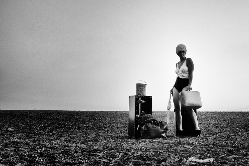
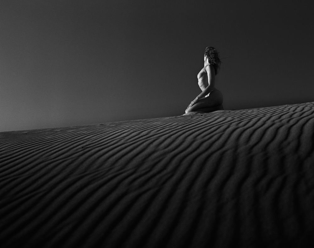
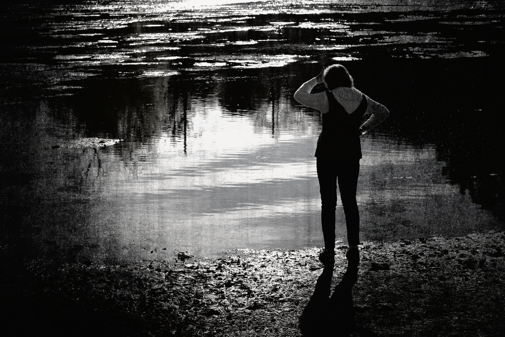
Critique on the photo ”Dark Mood” submitted by Robert D. Kusztos
This is a photograph where I try to convey a dark mood. The main subject is the human figure whose body language expresses confusion, frustration or perhaps even depression. The figure could be anybody of us turning away from the viewer. The surrounding is dark, desolate and quite neutral. The black and white conversion enhances the mood. No need for colour here. The composition simple and the main subject attracts our attention immediately. Rule of thirds utilised.
My questions are: does the viewer get my message even without reading the title?
Can I improve the meaning of this picture with a different body language, composition or editing?
Senior critic Ivaylo and Teodora
I guess there could be a lot to write about your image but I will try to keep to the questions you put at the and I hope I can help in a way.
If you could think of improving this image, I would go for two changes that seem reasonable. First, as you said - the body language. The figure is turned from the viewer, but something does not match my feeling of dark mood. Seems more like the sun shines too strong in the eyes of the subject and he/she is trying to hid behind the hand and observe something.
If I try to imagine depression I think of more loose body and hands, hanging down with no power and no will to live, to act, to do anything but just dwell in a strange empty world.
So, the body language could be improved in my POV. Next to this comes the editing. You found your direction of creating a dark world with some bright accents... there is the suspected atmosphere. Just the contrast seems slightly overdone. The borders between light and black have some artefacts which disturb the fluent natural perception of the mood of your picture.
Probably some gentler contrasting and brightness levels editing could make the image more smooth but still dark and moody.
And last, the thirds rule is kept here but I just have an idea - a square could also do for this image. Now the left part feels a little hanging - not really contributing to the overall mood and suggestion but pulling the eye quite intensively. So, this is a conceptual work, giving an objective critique is impossible. I hope my personal POV gives you some directions and helps a little.
Senior Critic Steven T
Thank you for describing the theme you were aiming for. I really like your 'test' of removing the title to see if viewers will understand the image based on its visual language alone.
The pose and body language could be read as confusion/frustration/depression, but it's not an unmistakeable message. Reducing the image to monochrome helps the theme and the large areas of pure black help too. I think with the title, the image works, but without, the theme isn't quite so clear.
I spent a few minutes looking in your gallery, and, from some of the images there, I'm guessing you know your way around Photoshop - so I have some editing suggestions. First, I think the image could be considerably darker overall, but the highlights of the woman made lighter. That would make her stand out from the background. If you were to make a rough selection around the woman - just from her right hand up to just above her head, you could brighten the highlights in 'Levels'. The 'History Brush' will restore the background if some of the brightening effect spills over.
The big change I would try if it were my image would be to distort the woman with the 'Edit>Transform>Warp' tool. Her head could be made to look "hung down'.
After warping, the History Brush or the Clone tool will restore the background.
I tried this out on a screenshot and it worked OK. It's a subtle change, probably not as effective as re-shooting with the subject in a 'darker' pose would be.
We always appreciate it if we get the exposure data. It makes it easier to analyse the image and offer suggestions - and we learn from it too. 1X removes EXIF when photos are uploaded, so it's necessary to type it in manually.
. '