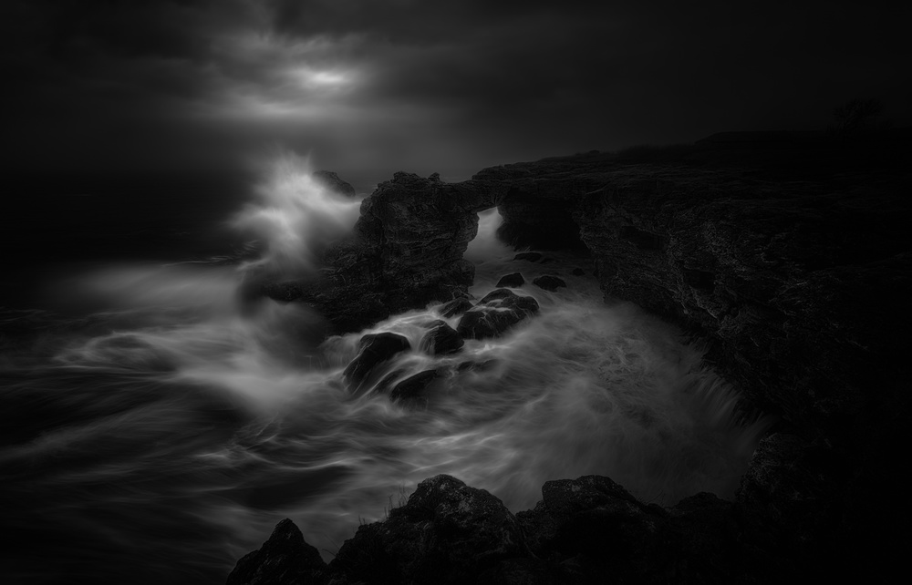
Tips & Tricks
Sunrise over "Reine": Review by the Senior Critics
1x Blog-Tips & TricksPublished by Yvette Depaepe in collaboration with Theo Luycx, Head of the Senior Critics
1x has a unique feature the founders are very proud of: the photo critique
Members can submit pictures to a team of knowledgeable senior critics. Their feedback is useful, interesting and enriching even for the best of us.
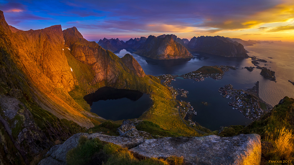
Critique on the photo ”Reine” submitted by Frantisek Zvonecek
"Reine” (Lofoten – Norway)
Photo taken from Reinebringen, about 650m above Reine (Lofoten - Norway) a few minutes before sunrise on the 2nd of October. I have just one question: I would like to know why this photo was rejected from your point of view? Thanks in advance for your suggestions and advice.
__________________________________________________________________________________
Senior Critic Miro Susta
This is a fine mountain landscape depicting its surroundings and with a well captured background topping out at well over 650m.
Very nice composition with incredible scale and leading the eyes through the scene. The patches of small water ponds and the houses along the water bay are eye catching. The golden sunrise light is brilliant. The wonderful colours make it a cracking capture of the lofty heights under the open sky. So nice to see a shot from a completely different part of the world. Indeed grand work and very special.
May be you could consider a wider landscape format, almost panoramic (just a suggestion). The rocks on both sides are abruptly cut and so is the foreground rock too. It would also be great to see some more of the beautiful sky on the right side.
All in all a beautiful photo with lots of potential.
__________________________________________________________________________________
Senior Dominic Schroeyers
First of all, don't be too disappointed because the picture didn't make it to the front page. Just use it as a motivation to try to push your limits even more. But most important, keep the fun in making pictures.
Let me give a look at your picture. First thing that I notice is that the colours are very saturated. Maybe a little too much for me. But don't change it yet, lets look a bit further.
I see a huge contrast between the houses in the shadow, and the sunlit mountain. I would try to lessen that contrast a bit.
If you take the orange and brown tones and reduce them a bit it looks more in balance. And at the same time the image looks less saturated. You can do this easily with the white neutraliser tool in Nik Efex. Just click with the pi-pet in the orange from the mountain and move the slider at taste.
I like the clarity and the sharpness through the picture, from front to back. However, be cautious not to over sharpen. At the peaks to the left I see some sharpening lines. There are ways to keep this sharpening, and easily remove the lines caused by it. If you want to know more about that just let me know.
About the composition, I'm not convinced with the balance. For me there is too much weight on the left frame. My suggestion is to crop with a 2:3 frame. Keep the height as is, and crop from the right so only 'Fanous' remains at the bottom and 2017 is gone. By doing this, you loose a piece of the mountain at the left and make it less heavy. The pool will be close to the strong 1/3.
Apart from these suggestions, let me say you made a beautiful image with great light.
__________________________________________________________________________________
Senior Critic Andreas Agazzi
You have received already very good comments from Miro and Dominic, I would like to underline them as well. Beyond that is actually not so much to add, but let me give you my thoughts as well.
Composition: My eye starts at the bottom where you have rock and with grass on it, moves to the left on to the very nice cliff that is full in the sun and then proceeds towards the open water with these fantastic rock formations. Ideally, my eye would now rest there but it does not, it falls back to the cliff at the left side. Unfortunately, this is not considered to be the correct way. The left side is too dominant and 'steels' the show.
Exposure: A bit the same as above mentioned, the eye should be guided to the brightest area in your image. Even though the upper right corner is bright, it is far less weighted than its opposite corner. What might work is applying local corrections for the brightness. But I would also try whether you can add some contrast and clarity to the rock formation, they are pretty dull compared to the rest of the image although they should actually mark the main attraction.
Distortion: Given by the very wide angle for your lens there is a strong distortion to be noticed. You should be able to correct this with your post processing software tool, either by setting the lens corrections to automatic or by correcting it manually.
Format: I see it the same way as Miro and would try to reframe it to large landscape format. If this is not a crop here I would just reduce the height by cropping it from the bottom and the top with the same value.
Your image is very nice, the critics here are really just to offer options that can make an already very good image to an even better one. Hope that was of any help.
__________________________________________________________________________________
There is a very simple thing that might have held curation from publishing it, your signature/text in this. If you read the FAQ, you'll see that's allowed to do, but will not be published: https://1x.com/about:
Do you allow copyright text in photos? All photos on 1x are automatically watermarked by us with your name. You are not allowed to add your own watermarks or copyrights on photos sent to the curators, because we want all the photos in the gallery to have a uniform style and watermarks are sometimes disturbing.
Apart from that, I agree with my companions here. The bright edge on the right is really a hard cut in your flow.
Part of the sensation in this photograph is the directional light on your rocks, and the much you may like the little bright grass and front rock, the yellow sky, it distracts.
Cropping it away may be a hard decision, but in my view it helps. I left the 80% from the left and 87% from the top only. Which still conveys the depth, focuses more on the shape on the left, while showing the little town to get a feeling for dimensions still.
It may hurt a bit, but simplification is sometimes the route to a more intense photograph. I fully understand if you don't like the idea, though.
__________________________________________________________________________________
Author Frantisek Zvonecek
I will try to frame the photo differently and do some corrections.
But personally I love colours and this kind of saturation is fine to me.
I know that I left my signature there and that is a first big mistake.
I am not disappointed at all, on the contrary. I just like to have your opinion because I want to improve myself. Many thanks, your comments are very useful to me.
Reply from Senior Critic Mike Kreiten
You're welcome, Frantisek!
The most important is that you stick to your style, if vivid is your thing, do what you love to do.
Nobody really knows how curation works, apart from the curators. But a sentence I'll never forget from the interviews of curators (worth a read!) is that they're after the best everybody can do.
It may take a few photographs before you could judge what your best really is. So keep up the very good work, and we're happy to "loan you our eyes" if you want to know how it works for others.
. '